 FA+
FA+
5040
Views
Views
704
Favorites
Favorites
Category
Artwork (Digital) / Fantasy
Species Dragon (Other)
Size 1280 x 989
File Size 1.62 MB
Report this content
More from Rhyu


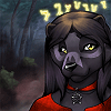
Sorry for the delay on posting things, i've been working on this large picture for the last while and can now post it : )
A commission for sephirothiel of himself and
  kumagoro sharing a tender moment.
Spent far longer on this than I should have but I'm definately happy with how it turned out in the end.
A commission for
 sephirothiel of himself and
  kumagoro sharing a tender moment.
 Spent far longer on this than I should have but I'm definately happy with how it turned out in the end.
Category Artwork (Digital) / Fantasy
Species Dragon (Other)
Size 1280 x 989px
File Size 1.62 MB


Thank you!
I don't actually have any tutorials (mine or otherwise) for BGs as I've only recently gotten into doing them. I'm not an expert but here are a few tips:
If at all possible try to at least think about the background before you start drawing your character(s) and even draw the BG first if you can. Its not neccissary, but it helps to avoid "floating in random gradient land or out of place in infront of a backdrop" type feelings. You can even start to include lightsources in the BG and it helps to have them drawn out first so as to make sure they're evident on the subject in the right way.
When picking colors or even ideas for backgrounds consider the colors you're working with in the subject. Ie. if you've got an orange character and you really want to make em pop, try to work a lot of blue into the BG (lots of sky, water, blue flowers etc).
Also, don't feel that you're restricted in palate to reality or just a few colors, rarely is everything a single flat color in reality and in art you control the colors so have fun with them. The grass in this picture for example is actually more yellow than it is green. By making it a bit darker yellow and having it next to the purple of the Kuma (the redness in his color helps emphasize what green is in the grass) the grass looks green, but it retains that warm feeling of the picture (instead of having used a pure green which is a bit more cool in feel and would have contrasted a bit too sharply with Kuma for this particular picture- there is a place for contrast and a place for unity, I was aiming more for unity in this picture given the overal mood).
If you're really in need of some assiatance with this I find it sometimes helpful to look at other pictures with colors you really like and try to figure out what it is about those colors and maybe even hold onto them for later use. You don't need to use the colors in the same way as the other picture or even the exact same colors, but it can be a helpful starting point.


Hey not sure if you already knew but someone is using this pic for profit on Ebay.
https://www.ebay.com/itm/352788171939
https://www.ebay.com/itm/352788171939
Comments