 FA+
FA+
2303
Views
Views
184
Favorites
Favorites
Category
All / All
Species Unspecified / Any
Size 1000 x 727
File Size 1.39 MB
Report this content
More from dirtsecret


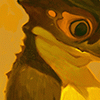
So I did my first ink/wash painting in over 2 years. A little unsure about it, but it was a lot of fun. It isn’t very refined or professional looking.
Need to practice with this a lot more.
ANY CRITIQUE?
Need to practice with this a lot more.
ANY CRITIQUE?
Category All / All
Species Unspecified / Any
Size 1000 x 727px
File Size 1.39 MB


I love how you illustrate your characters.
Nothing seems to stand out to me. You have your most contrasting values around him so they pop out really well. I like how you have faded off the grounds tones around him and have other drawn elements (like the dust and earth) flow to the centre as well.
The lightened trees in the distance give a great sense of depth, and go no way near your hottest values up front, and tops off the atmosphere.
Only possible suggestion is maybe have the brightest value in his eye compared to the fungi around him?
Damn you dominate at traditional as well!


Beautiful! I think this really, really came out well- I love the texture of the paper; it really, really brings a whole new element to your style. <3
Like Stucat said; there's not a whole lot that really jumps out to be critiqued; you have an amazing sense of contrast and value. I also really love how you can add so much detail into your backgrounds, yet they're not distracting and compliment the characters very well.
Like Stucat said; there's not a whole lot that really jumps out to be critiqued; you have an amazing sense of contrast and value. I also really love how you can add so much detail into your backgrounds, yet they're not distracting and compliment the characters very well.


There is an abundance, on the right, of "light" in this picture, but it's offset by the tree (in the center of the piece). I'm not sure what is in the top left corner, (the little white lines) but they even out the circle in the bottom right corner. I love the detail on the ground and the the subject's stark-white outline. I no flaws, only a great piece. <3


Comments