 FA+
FA+
736
Views
Views
42
Favorites
Favorites
Category
Artwork (Digital) / Miscellaneous
Species Unspecified / Any
Size 720 x 878
File Size 271.5 kB
Report this content
More from Lizkay


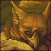
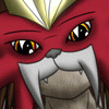
The final design and Lineart/Inking for the TF creature SunShine, actually kept a lot of the initial ideas and also could get his ALT-Mode done, which is a overall new design I came up with (so no, the Crossquad ATV you see here doesn't exist in RL already) I just don't found any ATV vehicle which suits this style...
Inking completely done in Illustrator, the wheeee bit shading added in Photoshop, and yes, he has actually a Battle- and a Charge-Mode as well, but I don't think I will make seperate sheets for this.
Final Concept as well as the other sketches of him can be found in my gallery here ;)
Kay.. he needs colors.. if you have some ideas just tell ;) or give him some colors yourself, I am actually thinking about a plastic-like grey with red/yellow stripes....
and yes, almost forgot.. FULLVIEW IS HEALTHY!
Official Transformer Stuff is © Hasbro.
Category Artwork (Digital) / Miscellaneous
Species Unspecified / Any
Size 720 x 878px
File Size 271.5 kB


The steady lines and typography are absolutely fantastic. The way you depicted the faceted surfaces on the mech and vehicle really work. :D
The only thing I think needs improvement is that claw pointed towards us. The blur doesn't make sense to me... an object closer to us should be darker and sharper. I think you could remove the blur and thicken the lines on that claw and the sense of depth would be much improved. :)
The only thing I think needs improvement is that claw pointed towards us. The blur doesn't make sense to me... an object closer to us should be darker and sharper. I think you could remove the blur and thicken the lines on that claw and the sense of depth would be much improved. :)


Ohey, I was always into Mechas, but never really a Fan of anyhting existing, cause.. yes.. no chance to get/watch anything here XD
and that is actually a font, (never really said I completely made it myself ;) I just redraw parts/letters of it, I didn't like or which were hard to read)
and that is actually a font, (never really said I completely made it myself ;) I just redraw parts/letters of it, I didn't like or which were hard to read)


Comments