 FA+
FA+
1543
Views
Views
29
Favorites
Favorites
Category
All / All
Species Unspecified / Any
Size 750 x 531
File Size 269.5 kB
Report this content
More from Amocin


Listed in Folders


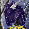
Here is a side by side of two different coloring styles. The one on the left is a new soft shading style, where as the one on the right is my weird textured one that everybody seems to really like.
Now.. Honestly I dont do this comic alone. My husband takes care of a lot of the non-art stuff.. But lately he has not liked the style of coloring that you all seem to like.
Now this is a question to all you guys with a side by side of what the difference will look like to the comic should a change in coloring occur.. I just really want to know your guy's input. Would you like to see the coloring changed to the one on the left, or the one on the right?
Its obvious I will have to do some things to make the coloring style of the left a little lighter but I am sure with time I will be able to do that. Let me know what you guys think. ^.^
Edit: Third option at the bottom as suggested by another. Background being one way, characters being another. Please Refresh.
Category All / All
Species Unspecified / Any
Size 750 x 531px
File Size 269.5 kB
Listed in Folders


I gotta admit I like the style on the right side. The shading is much more precise and clean, a very unique shading.
Where as the style on the left looks too blotchy and almost muddled.
The soft shading looks great on larger pieces and would be fun to mess with in ways with backgrounds and elements.
But the original shading style makes it easy on the eyes. I feel like i follow the characters line of flow more with the cell shading style.
BUT this is not to say later on the newer shading with practice would look great. But for now I really love the one on the right for character.


As it stands, the one on the right works best. The one on the left could work for the comic, but it needs more. Like you said, the contrast is off, and its too dark, but apart from that, the complete lack of detail takes way too much away from it. For example, on her hand, there is no visible bone structure and looks like a hand of a 200pound woman, not a skinny adventurer like Kinar. Also, detail creates texture. On the one on the right, the shadows and highlights lets us know that her body isn't smooth. It gives us a semblance of texture, which turns into fur in our minds.
How will it work? Well as it is, it works extremely well as a base painting (With the contrast balanced, ofcourse) On top of this base coat, you would add sharper shading and highlights to balance it out. I might be biased, since if you look at my gallery, im clearly not a fan of soft coloring :P
If you dont mind, and if I find the time, tomorrow I'll snatch this image up and take it into photoshop, to show what im trying to say more clearly.
In the end, it's your comic, and whichever style you choose wont keep us from following it. :)
Thanks for the input as always. I would love to work more on the soft coloring, however when I do add texture to it, it seems to take a lot of time... doing so would take away from the frequency of the comic updates. While I am sure I would get faster with time, its not something I am sure about. The concern comes more from my husband who would like to see a change in the comic. He does everything non-art related for it, such as updating the news, site creation and management and all that... so I kinda feel like he has some say in it... Though in reality, I like the one on the right. I can always improve it and make it even better without taking up a crud load of time, but I feel like a lot of people have come to love this textured/sloppy look as its kinda unique to the comic.
But either way I would love it if you could take the picture into photoshop to show me what you are talking about. I am always willing to learn. ^.^
But either way I would love it if you could take the picture into photoshop to show me what you are talking about. I am always willing to learn. ^.^
Hey! Here's what I meant.
http://i.imgur.com/xM3zt.jpg
I might've been wrong about the contrast, since I just saw it on another non-HD screen, and it looked fine...
So basically, now that I went ahead and did it, all I did is reduced the contrast slightly, and added highlights and over-shadows. Just lines really, you dont have to go all out and render fur lol. After all the cropping, it took me 2-3 minutes to add the highlights with a small brush.
Also, I went ahead and defined the knuckles a bit... :3
Ahh I see now, thanks for that, it really helps to show what you were talking about. I will try to work on this on future pictures. However it seems that most people like the comic the way it is.. so I guess I will ask again once I learn how to better define fur trying something similar to this.

well I like the soft shading one but I also like your "weird textured one" but really there are things I like about both like how your one on the right has the lines in it making it look like there are slight details to the fur but I also like the left one in how it looks just as much. but really I say it's up to you as the artist which you use.


It seemed more dramatic to start that way. So you question what happened, and wait to find out the answer.
As far as the world they live in, they are a part of Blizzard's Azeroth in the MMO known as World of Warcraft. To make a summary would take a very long time. So I suggest looking at the WoW wiki for questions about the world they live in.
As far as the world they live in, they are a part of Blizzard's Azeroth in the MMO known as World of Warcraft. To make a summary would take a very long time. So I suggest looking at the WoW wiki for questions about the world they live in.

Comments