 FA+
FA+
875
Views
Views
31
Favorites
Favorites
Category
Designs / Fanart
Species Unspecified / Any
Size 525 x 125
File Size 145.6 kB
Report this content
More from SirRob


Listed in Folders


Planned to get this done for May, but unexpected stuff happened so I wasn't able to finish it in time (to be honest, I probably wouldn't have finished it in time anyway). Since the end of the month is coming though, I figured I'd finish this up to at least give it a chance for June. Not that it'd make sense for June, being a spring banner... Heck, it wouldn't even make sense for it to be a May banner- Cherry blossoms bloom at the beginning of spring.
Full size
Edit: Used a subtler gradient at the bottom. You may need to refresh to see the current version.
Edit Edit: Changed the gradient to a brush stroke.
Full size
Edit: Used a subtler gradient at the bottom. You may need to refresh to see the current version.
Edit Edit: Changed the gradient to a brush stroke.
Category Designs / Fanart
Species Unspecified / Any
Size 525 x 125px
File Size 145.6 kB
Listed in Folders


So this was the piece you mentioned in the forums?
It's really good you tried something different and actually finished it, congratulations!
Now, onto it:
-Why the Japanese imagery? Next month is June, but I'm not sure what it has to do with the period you're referencing here.
-Cherry blossoms. Their constant presence in the anime I watch has made them a bit annoying to find. Objectively speaking, these have the right color and feel proportioned, so they're fine. Composition-wise, they're in a good (if safe) place, much more so with the letters balancing them out.
-A simplified landscape, I see. I only wonder about those clouds, the ones closer to the spectator, is it possible to see them at that height?.
-I'm really bad with perspective (often I find myself realizing things actually look closer than one would imagine). Nice work using the landscape's natural roads to create it, though.
-Not sure if this was the intent, but the overall composition without the letters makes me focus in Fender's face, it's so cute! With them ,though, it feels a little bit tacked. My eye still goes to Fender's eyes, but I can't ignore the letters enough to focus on them and the cycle repeats. I found you avoided this, though, by painting the roof with an "intermediate" color: in this sense, the darker colors are in the front and the clearer ones are in the back, which create the illusion of the radiant sun.
-Rednef's face looks a bit weird to me, the muzzle in particular. But I never liked her design to begin with, so, eh.
That's what I think of it on a first impression.
- I wanted to do a Japanese themed banner because I love Japan! The question you should be asking is, "Rob, why don't you draw more Japanese stuff?"!
- The cherry blossoms behind Fender were a last minute addition. I'm really glad I added them- to me it adds so much depth to the background.
- I'm not quite sure about the accuracy of the clouds, or anything else, really. I just drew what I thought looked good. I understand the importance of being knowledgeable about those things though... I definitely have to take my art more seriously- it's the only way to improve.
- I'm not good with perspective, either... I'm glad you find it palatable though.
- Fender is definitely the focus- it was the first thing I drew when I was sketching it up, I think. The letters -are- tacked on. Not much thought went into how it would interact with the rest of the image. The intermediate color of the roof is just a coincidence- pagoda roofs are typically a greyish blue. When I sketch, I don't really think about the composition in terms of color, just where the shapes are placed. I should probably get into the habit of putting more thought into the colors in the preliminary stages of drawing.
- Maybe I made the muzzle too angular? I played around with her design a lot... I don't like her design too much, either,


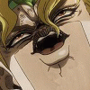


This is really rather nice! :> I like your use of colours in the background! I use the old lighter theme, and your banner it looks better with it than the darker one, I think. The banner itself is very calm and relaxing and just over-all nice. Rednef's mouth looks a little weird, but I think that comes in part with Refnef having a weird-looking head in general (Sorry, Rednef character-account, if you read this!)
But yes, lovely!
But yes, lovely!
I think it is the chin. Its pointiness gives her a very hammer-shaped looking muzzle. Almost like a sergal's.
But looking at it longer, her sharper angles sort-of serves as a nice balance to fender's rounder face(which, btw, is adorable and super-hugable).
Also, I somewhat agree with Ariosto about the wording and the characters' faces fighting for eye-time. I'm not entirely sure if his impression was more negative or positive on it, but I personally see it as a good thing. It makes the viewer look all over the picture while tracking back and forth instead of just focus on one aspect, which is optimal because there is so much to find in there.
And no way XD;; Shoo-in? I don't know about that! There are quite a few nice banners made recently that could be used. This one is definitely in the top-tier of possibilities in terms of quality and 'gorgeosity'~ The ants carrying Fender away was also a fun one that people might enjoy too, as one can never underestimate the power of humor.


Comments