 FA+
FA+
3001
Views
Views
393
Favorites
Favorites
Category
Artwork (Digital) / Anime
Species Human
Size 936 x 1368
File Size 750.2 kB
Report this content
More from Yuurei


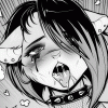
Just a little something I whipped up in time for Anime Next. Her costume is kind of a mix of her classic look as well as her Arkham City design, with some personal flair and original changes as well.
Constructive criticism only.
Constructive criticism only.
Category Artwork (Digital) / Anime
Species Human
Size 936 x 1368px
File Size 750.2 kB


This reminds me a lot of the Kotobukiya Bishoujo line of artwork they do for their figures. Totally gorgeous~
Your colour shading really makes the different material textures show off, even though they use the same tones and don't use patterns on them. Really nice job.
The hair is also awesome.
Your colour shading really makes the different material textures show off, even though they use the same tones and don't use patterns on them. Really nice job.
The hair is also awesome.
Actually, the only thing I can see on it that bothers me a little bit is that the head looks a little too far to the right. With the shoulder lowered like that and the head off and back to the side, it looks like her head is twisted back too far in the one direction. Just makes the pose look a little bit off to me.


There's something off about her left hand and arm, though I can't honestly articulate why or how. Anatomy is such an odd thing... you can draw something absolutely correctly and it looks odd, but you can then draw it wrong and it looks better. I find this issue a *lot* with hands and their perspective.
More importantly, I personally reaaaaally don't like Harly's AC design. It just feels... generic. Like something her henchwomen would wear.This however is definately not generic! It really feels to me like something she'd wear, and be instantly recognizable as harly herself! I *really* like this design!
More importantly, I personally reaaaaally don't like Harly's AC design. It just feels... generic. Like something her henchwomen would wear.This however is definately not generic! It really feels to me like something she'd wear, and be instantly recognizable as harly herself! I *really* like this design!
I totally agree about anatomy. It is crazy how you can reference a photo and try to draw things exactly how they are seen in real life, and have them look completely off in the art work. I have actually traced photos (for learning, not for actual art pieces) to try and get an understanding of how anatomy works and my trace would always look so awkward compared to the actual photo, despite the fact that I would try to trace as closely to the photo's "lines" as possible. It is pretty crazy.
And thanks, I am pretty stoked about how this design came out. The overall drawing isn't perfect and I would have spent more time on it if I had the time to spend before Anime Next. But overall I am happy and enjoyed combining her more modern look with certain aspects of her classic design while adding some new ideas of my own. :D
And thanks, I am pretty stoked about how this design came out. The overall drawing isn't perfect and I would have spent more time on it if I had the time to spend before Anime Next. But overall I am happy and enjoyed combining her more modern look with certain aspects of her classic design while adding some new ideas of my own. :D


It looks like her legs aren't egual. I know ones closer, but they look the same size, that could be doing it, or it might be that you have her hip line angled up to the right and her knees down, which made the black boot come down farther. Notice how the leg bend on the black boot is outside, and on the red boot it's inside. Really easy to fix if you'd just bring up the top of the black boot, and make the kind of 8 figure on the boot larger then the one on the red. I know it seems like thats saying it's alot, but it's not, the smallest flaw can make something look worse then it is.
The hands look fine, so just don't worry about that, maybe defining them a little more for future images but nothing that really needs to be changed here.
The thing they mentioned about the head, is because the neck is a little too angled for the head and how long it is, but honestly if you weren't looking for flaws, it wouldn't stand out that much. Easily fixable by moving the angle of the left side of her neck to the end of her jawline where her hair curl comes down.
Everything else is pretty well drawn :3 those fishnet are A+ drawn and her mouth is pretty damn sexy too!
Hope that helps~
Thanks for the input! I noticed a few of those flaws, but the problem is that, because I leave for Anime Next on Thurs and have other things to do before then (such as having prints made up), I just didn't have the time to fix some of the smaller flaws. So it definitely isn't perfect, I just didn't have the time to really nit pick at all. It is what it is I guess, haha.


Oh my god she is just as cute and pretty as she is on every Batman cartoon I've seen. I'm partial to the red and black suit she wears in most of the Batman toons. I love it so much that it was the inspiration for my own card person, Wild J: http://www.furaffinity.net/view/1466620/ (this pic is about 5-6 years old but is the cleaner one i've done).

While there are tons of Marvel and DC girls to choose from thought of Lady Death ( wiki link / Google images ) or Purgatori ( wiki link / Google images )? Seems like they'd be good material for your style. (I sure hope these come out as links and not the god awful direct addresses)


Comments