 FA+
FA+
8035
Views
Views
346
Favorites
Favorites
Category
Artwork (Traditional) / General Furry Art
Species Otter
Size 823 x 630
File Size 129.5 kB
Report this content
★
More from Ruaidri


Haha, wow, this did not turn out well. But that's okay. As always I'm using this time in between commissions to figure some stuff out and do some experiments, and with that kind of playing around comes some shitty pictures. But as I'm sure many of you know, this FA gallery isn't intended to showcase only my best works but my entire progress as a dude who draws stuff, so you get to see the down days and failed experiments too.
Let's see if I can make the next one come out a bit better. :P
Let's see if I can make the next one come out a bit better. :P
Category Artwork (Traditional) / General Furry Art
Species Otter
Size 823 x 630px
File Size 129.5 kB


I guess I don't know what I'm looking for, but it looks pretty decent to me. Mora has a point about the slightly wonky ankles, and it almost looks like it's a macro piece because the background looks small compared to the character, but other than those, it's really good work.


I just don't like to use the word 'artist'. I don't feel like an artist. I try to emulate some artistic ideas in my pictures now and then, but when I think about me, the word 'artist' just doesn't seem to feel right. Unfortunately there's no easy word for guy-whom-draws-things-but-isn't-an-artist. x3

I got more or less the right idea with them... I'm aiming to get a somewhat low-detail background style. A skilled watercolour artist can make good use of colour and shape to suggest what they want without spending a lot of time on details and it'll look really nice. When I do it it turns into a bit of a mess, but at least I have a goal in mind after many years of flipping and flopping and never knowing how I want to do things. Though there's still a few things I'm not so sure of... I think my characters stand out a bit too much right now so I may need to put a bit of ink on the background as well to help bring everything together.
...pretty big response to such a tiny comment. xD
...pretty big response to such a tiny comment. xD

I agree that you should put some ink into the backgrounds. Obviously going with more ink on what's closer to the viewer perspective wise. More detail on the ground in this piece would have helped blend the character into the background and mesh it all together as well - nice shots of muted green grass sprouting up over her arms and such like.
But of course that's just my silly opinion
But of course that's just my silly opinion

That's something I'm working on, actually. To be perfectly honest I think it's simply because my paints are rather cheap, hahah. It's hard to get really bold colours out of them, and I'm usually trying to lay the stuff on fairly thick. Oddly, a few colours are great at coming out brightly, oranges and reds do fairly well, and one particular blue does alright, but most of my paints are very faint when they're wet enough to actually work with. I'll be getting some better paints soon to see if they help, but for now I'm doing my best to brighten 'em up a bit. I'm actually in the midst of painting another picture as I type this, and while the background is considerably more simple, I think I managed to darken it up effectively. I'll leave that up to you though I suppose. x3


It's a nice picture, as nearly all of yours are, but her face looks too much like the canids and vulpines in many of your other pictures. Maybe work on getting the shape of her nose, her muzzle, the eyes, ears and muzzle, the proportions, more otter-like? Or maybe just more practice...
(Then again I'm no artist so I'm probably not one to talk.)
(Then again I'm no artist so I'm probably not one to talk.)

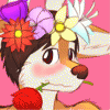
You say it didn't turn out well, but i honestly beg to differ. The figure looks great, but the background is just plain beautiful. I find that to be a staple of all of your artwork, your backgrounds are consistently so amazing <3
But I think these characters would fit better if you tried lineless coloring, to fit more with how the backgrounds look. But still, I like this piece very much ^^
But I think these characters would fit better if you tried lineless coloring, to fit more with how the backgrounds look. But still, I like this piece very much ^^

Comments