 FA+
FA+
1401
Views
Views
15
Favorites
Favorites
Category
All / All
Species Unspecified / Any
Size 500 x 500
File Size 49.4 kB
Report this content
More from Keto


")


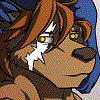
I just got Corel Painter, and it's pretty awesome, but I'm still learning my way around with tools and crap.
Pleasantly surprised to find the acrylic paint brush to work pretty well like real acrylic paints.... so I did a practice drawing of some anthro's arm just to sort of get a feel for it.
I still have trouble getting good color reflections.....
Pleasantly surprised to find the acrylic paint brush to work pretty well like real acrylic paints.... so I did a practice drawing of some anthro's arm just to sort of get a feel for it.
I still have trouble getting good color reflections.....
Category All / All
Species Unspecified / Any
Size 500 x 500px
File Size 49.4 kB


You mean as an art technique, and not as technical issue?
Forgive me if I telling you something obvious:
From a technical standpoint, Painter has a 3Dish lighting system that will reflect off of brushstrokes when an Impasto brush is used (this might only be oils). You can adjust the angle, color and intenisty of lights, and toggle it on an off. This would give the effect of using a shinier/more matte paint.
If you're familiar with Photo-shop layers, Painter has a special layer for "shadows", which works better than PS's "Multiply" layer. I find that using a Shadow layer for shadows, and another "overlay" layer for highlights works well. This is handy because you can adjust the shading/hightlights without affecting the underlying color/texture/sketch.
If you're looking to make a reflection like off of a chrome ball, there's a built-in "dynamic" that's like painting with blobs of mercury.
If it's a techinical issue, and you give a more specific example, I could probably give you some tips. If it's an artistic technique, well, you're probably way ahead of me.
I'm pretty clueless about. :)
But if you have a question about Painter, give me a shout. My top 3 tips are:
1. Use a big canvas, I usually use around 3000x4000 pixels. The media looks more "natural" and less digital on a big canvas. Reducing the final size of your picture for distribution will look a lot better than starting with a small canvas to begin with.
2. File->Preferences... General. Turn on "Draw Zoomed-out Views using image Averaging". This anti-aliases the picture, so that fine details like sketch lines aren't jaggie. It will also slow the program down somewhat.
3. If you're not using Impasto (mostly oil painting), turn the effect off, the program will run a lot faster: In the window that contains your canvas, in the upper right corner there's a little star, make sure it's unselected. This will affect how the image is displayed and interacts with Canvas->Surface Lighting.
Also, liquid ink layers have hidden magical properties: Create a Liquid Ink layer, choose a "Smooth Camel" from the Liquid ink brush category and draw a line. Double-click on the liquid ink layer in the layers palette, and you change the Threshold and Amount settings. This will change the thickness of all the the lines on the layer, how the ink clumps together, and makes the ink more viscous (i.e., you'll see brush strokes). L.I. Layers are affected by Canvas->Surface Lighting, and are still visible if you turn off impasto.
Okay, I'll shut up now. ;) Keep up the great work!


Comments