 FA+
FA+
1995
Views
Views
138
Favorites
Favorites
Category
All / All
Species Unspecified / Any
Size 627 x 854
File Size 385.4 kB
Report this content
★
More from o-kemono


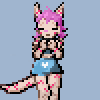
My first attempted on drawing Krystal from Star Fox. Simple flat cell colored with a bit changes to her armor. It was worth a try.
Feed back would be awesome.
artwork © 2012 Alex Cockburn
Feed back would be awesome.
artwork © 2012 Alex Cockburn
Category All / All
Species Unspecified / Any
Size 627 x 854px
File Size 385.4 kB


In almost all images I've seen of familiar or signature characters from other galleries and websites, they all look the same. No unique details or changes to make the character stand out from the other copies. There is no right way to draw any characters. Plus, if you draw a character differently, it stands out form the crowd and people will remember it more so than other "right from reference" copies. But hardcore fans...well...they will yell and scream at the artist until it looks just like the illustration the original artist of the character draw it.


I'm having a hard time associating the character in the drawing with the character of Krystal. The elements are ceraily there and recognizable, but for some reason the character strike me more as a kind of a cosplay of Krystal than Krystal herself drawn in your style.
I've been browsing other pictures of her (fan made and original alike, what ever Google image search gave me) to try to figure out why. My guess would be that the two most important things would be the eyes and the hair and how they're most often depicted. They eyes are usually sharper and the hair is most often drawn with the "anime spikes", rather than more realisticly.
Also, the tail is usualy drawn more tightly bound than pictured here, but I'm not so sure if that actually makes a difference.
The body type in other drawings is also often more unrealistic, but I'd personaly avoid going there if at all possible. I think we've see way too much of that already

True, but I don't think that's a factor. At least for me.
I mean, those would make the character more easily recognizable, but I can quite easily recognize the character, even when she's drawn clother one her, when the markings are hidden (altough, often peaking from underneath).
But I did jut now notice a rather major flaw now. And I think this is an actual flaw, in contrast to the stylistic choises I've presented earlier.
Her face pattern. The blue is not supposed to run along the nose, but stop near the top of the eyes where the jewel is resting. A circular or triangular white patterns also seem recognizable, alough these seem to deviate from the "offical" pattern. (It's sometimes hard to tell just which pictures are offical or just well done fanworks.)
Sometimes to make a signature figure stand out is to draw him/her differently ^_^ I did miss a few things, but I wasn't really going for drawing the TRUE Krystal everyone remembers. No fun in that. Might as well copy and paste from another drawing. Its like my pokemon drawings. Im not going to draw the same designs from the game. Where is the unique touch in that ^_^
Sure. All I'm saying is that I personaly had to put in a lot of cognitive effort to get "Krystal" out of the character, which I don't think is desirable when trying to draw a known character. (I have to admit, I seem to be in the minority in this one.)
And since you asked for feedback, I tought I'd try to dig through my twisted toughts as to why. I can't say for sure if I got it right or not, but I did give it my best shot.
And since you asked for feedback, I tought I'd try to dig through my twisted toughts as to why. I can't say for sure if I got it right or not, but I did give it my best shot.


i like it, as for the staff-thru the hip thing, i think thats more because it almost appears she is standing at an angle to the viewer and she appears to be holding the staff at an angle as well, i see it and imagine the staff is coming out to her left-hand side toward the viewer


I like what I'm seeing! I will admit I love detail in designs so to not see her tribal markings and the gold trim on her outfit is a little odd, if not disappointing to that side of my aesthetics; however! I do like the changes to her outfit you've made and I think the LACK of tribal markings actually helps in this case! She seems more cute and innocent for it! ^__^ And the more I look at it, the more...authentic the lack of detailed embroidery and symbols makes her outfit feel, it's growing on me pretty quickly, hehe. I also can't tell you how happy I am to FINALLY see someone draw her hair how it might realistically look rather than the ridiculous anime spikes in her original design. I'd definitely like to see you do more art of Krystal. :3
Comments