
Tactical Strategy
Based on Chapter 2 of Birth of the Shivanian Heroes: "First Assignment"
Skaro and Zacquaris received the royal message from King Corus by a messenger. The message was written that he and the extraordinary, skilled Shivanians shall be invited to the Shivanian Fortress to involve in the battle. The land in Shivanian Territory was invaded and Rakrov Village was ravaged under the hands of Ta'zan army. This angered Skaro, outrageously throwing the message away. Under his grief, he complied King Corus's request and led the higly-skilled trainers of his school to Xan'orthras where his old companions were waiting.
Captain Vedran (the teal-scaled, yellow-haired and horned lizardman) led Skaro in the war room to meet his best friend Second-in-Command Khorvis (the dark-green scaled, frilled lizardman) who is with General Kravor (the basilisk lizardman). The quartet had been in the training since their childhood, so they reunited to participate in the vengeance, which Kravor should create a strategy according to the battlefield. They wear blue-and-gold garments as if they are elites of the Shivanian military. Kravor received from King Corus the unfinished map of Lizardland--where the east side of the Lizardland, the Ta'zan Territory, was never been drawn as the Shivanian scouts were killed on sight. Logically and comprehensively stating the plans and tactics, he marked the two armies, which Vedran and Khorvis should separate to the both sides of the battlefield as concealed back-ups. The main army will be led by himself and Skaro face-to-face against Ta'zan invaders.
Meanwhile, Corus's officials prepared the trained Shivanian soldiers and warriors on raptors, ceratopians, and pterosaurs. Zacquaris was adorned with raptor armor, seat, reins and stirrups, which he had dreamed long before.
Finally, the newest scaly-styled lizard artwork is made...I miss Skaro much ^^" It took me almost a month under school circumstances, so I wanted to continue this every week. I supposed to refer the war room similar to "Game of Thrones" episodes, but I choose this scene look like medieval style for high-ranked officials. (But, I still keep the jungle tribal style as they follow the nature and culture of Shivanian Tribe)
Three characters are new, Vedran, Khorvis and Kravor makes the first appearance, but sadly they are minor characters in the whole story.
I like the fashion colors: blue and gold...they are referred to "Crusaders" from Heroes of Might and Magic II.
After this artwork, then I can continue the other ideas besides original dragon and lizard art.
Art, characters and story © *kevindragon
Edit: Skaro's hand is fixed in right proportion and structure and Kravor's chest is slightly shrank, thanks to my dad for pointing them out, and referencing with his own hand.^^
Category Artwork (Digital) / Fantasy
Species Lizard
Size 1721 x 1213px
File Size 1.26 MB
I like a lot about this. Eyes, colors, scales, environment... to name a few.
But the carbon-copied human muscle structure doesn't appeal to me personally. I think such a creature would have a more smooth blend of human and reptilian attributes.
Bear in mind, this comment was still mostly compliments
But the carbon-copied human muscle structure doesn't appeal to me personally. I think such a creature would have a more smooth blend of human and reptilian attributes.
Bear in mind, this comment was still mostly compliments
I thought I’d drop a few lines. After all, this is a picture about your very own universe… [^]v’[^]
COMPOSITION:
It’s basically the same composition of characters, things and stuff - just like shown at the previous sketch:
https://d.facdn.net/art/kevindragon.....l_strategy.jpg
Of course, the room is completely new this time. It seems to be an octagon… or “almost round” room in the tower of a castle or something. I cannot really figure out, if that room is radial or not… but nevermind.
I’ll say some words about the room later.
CHARACTERS:
The same characters like shown at the sketch, but slightly better facial expressions.
Though I really have to say: this isn’t “Skaro” to me, anymore. I really cannot put my finger on it… if it’s the head, the (way too) huge body (with horrible large arms)… or if it’s his snout… I really don’t know. But I don’t feel like knowing this one anymore.
Covering up difficult body parts like the back, hips, legs or wrists is an interesting way of solving problems… but I assume it’s all part of the character’s armor and design right now. ^^”
The characters look quite okay, though. They have their different head designs and skin colours and we can at least see that they are four different guys.
FLAWS / ERRORS:
Hmm… don’t know where to begin.
Maybe, I just point out (before I’m going to repeat myself once more) that you have NOT corrected all the aspects, which we both have found out at the previous sketch:
https://d.facdn.net/art/kevindragon.....l_strategy.jpg
You said yourself that the arms or the characters are way too huge… and they still are. So, lemme give you my other aspects one by one:
Background
The background itself is a nice idea, though I can’t figure out the shape of the room. The details, like the bird at the window or the book shelf, are quite cute and add a certain flair. But the entire room depth and perspective is off! The background’s perspective and size does NOT correspond to the characters and the table in the foreground.
The other problem is light.
We have very bright light here… I assume that most light is been provided by the window(s). So, we have daylight, correct? At least the bright colouring of the setting would imply that we have daylight.
But you also added some torches, which do not really help here. Furthermore, the torches would NOT be that bright if lit at daylight. The entire lighting of the room is unclear and naïve. You know… it would’ve helped greatly, if the time of day was… NIGHT!!! ^_^
Also, most of these meetings are done at night… at least I would do it this way.
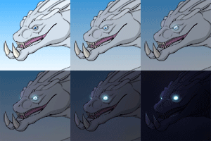
Why using words when I can show you a picture myself. Look here… this looks way more believable, does it not:
http://www.reptile-universum.de/mis.....y-LIGHTING.jpg
Arms
Way too huge!! Compared to the torso and overall body of the characters, the arms are way too massive. It seems to me that you were just focusing on showing us the muscled arms… but you forgot the whole picture – the whole body in the end.
Character proportions/anatomy
Before I bombard you with more comments, I just show you a picture I’ve done for you:
http://www.reptile-universum.de/mis.....rategy-LEG.jpg
I hope you get my point. After all, pictures say much more than words. And don’t start complaning now… the legs/feet are utterly WRONG!!!!!!!!!!!!!!!!!!!!!!!!!!!
CAN’T YOU SEE IT?
ANYONE…?
FINAL WORDS:
Many good ideas and it’s nice to see something new from YOUR world again. But you still have a great deal to work and practise.
And on a personal note: pretty effects and drawing each little scale one by one in the most beatiful way is NOT making an artwork “good”.
You must keep an open eye at the final result… the whole artwork – not just details.
You’re good at deails… but you really need to work on the complete picture!
And anatomy.
NOTE:
If you want to reply to my comment, please refrain from just repeating my statements again. Give me your own opinion or reply to my comment, but don’t just copy my words and write some “Uhhms” and “Awwwws”, okay?
Thanks.
I've been expecting for your comment about my artwork that tells they story of Skaro in his world.
I made few changes from the sketch where I found/missed the aspects that I talked about, It's sad that I didn't decrease Skaro's arm and should very much. But don't you know much about him because of these errors and his head structure? Well, it's kinda odd that you recognize him look different from the old one ---> http://www.furaffinity.net/view/5532924/
About the room background, I didn't actually use lineart to do perspective and architecture, so I decided to do digital brush strokes to test myself how well is painting backgrounds without using lines. X3
Me too, I can see Khorvis's (teal lizard beside Skaro) leg placed very wrong. To be honest, I was having much problems on how to place his leg (a different layer) correctly, because of the table and other character's perspective and placement, so I decided to put like that. XD
Thank you very much for helpful critique. And yes, more practice...again. To conclude my response, I know there will be much hope to make the future artworks better.
I guess, what I dislike about SKARO most, is his huge, muscled neck. His head leads from the top right into his back! He had a more defined neck in the past. His thorns are different, too... and his jaws, cheek and snout is different.
At least I think so. Looks like this to me.
And what nonsense are you talking about LINES AND BACKGROUND?
I never sais anything about lines or lineart. I talked about the lighting here!!! Funny that you ignored this aspect completely... after all, I did a real new ambient light for your artwork. Did you even see thst lnk?
Of course, I did find the important difference between your edited version of this picture and its original. (I talked about bad perspective.)
The night landscape fits, but my story is a daylight. The room may have been dark if there are no lit torches, even if it's a day--and they can't see the map
I wrote this reply short because I'm late for the class ongoing.
The night landscape fits, but my story is a daylight. The room may have been dark if there are no lit torches, even if it's a day--and they can't see the map
I wrote this reply short because I'm late for the class ongoing.

 FA+
FA+











Comments