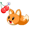
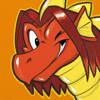
I finished the basic sprite sheet as you can probably tell from above. Chubeko was harder than TTN because of all the little details. I made a lot of expressions too and as time goes on more will be added. When I take the time I'll make walking and arm movement as well as head and hand positions. This takes a lot of time and I'll take a break from it and do another page or two of Mountain Grove.
You know there will be plenty more poses and even bigger and curvier versions of the sprites as I continue to work on them. I may even spritisize other people's characters.
Remember to save it as a BITMAP to keep the sprites clear.
Chubeko Koneko & Two Ton Neko Sprites © Two-Ton-Neko
You know there will be plenty more poses and even bigger and curvier versions of the sprites as I continue to work on them. I may even spritisize other people's characters.
Remember to save it as a BITMAP to keep the sprites clear.
Chubeko Koneko & Two Ton Neko Sprites © Two-Ton-Neko
Category Artwork (Digital) / General Furry Art
Species Unspecified / Any
Size 950 x 1230px
File Size 105 kB
Hmm. Interesting. Your structure work on the upper sprites is pretty good. I'm impressed by the detail!
However, you appear to be using the default MSPaint colours, which are unfortunately extremely gaudy. I'd pick a more subtle palette with less saturation. Try to avoid pure black for outlines, and don't be afraid of putting in some rudimentary anti-aliasing (by hand, that is). It'll smooth out the sprite tons without making it blurry. Also, try and avoid abusing the circle tool - a sprite will look more natural if you draw it like you would an actual picture.
Is there any reason you did the sprites so big? Were you going for "Marvel Vs Capcom"esque style?
In conclusion, they're pretty good, especially the hair on the braided one.

 FA+
FA+


Comments