 FA+
FA+
1662
Views
Views
17
Favorites
Favorites
Category
Artwork (Digital) / Miscellaneous
Species Unspecified / Any
Size 1024 x 768
File Size 254.3 kB
Report this content
More from dasAoD


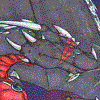
Just a little update -- Here's some new BG graphics, and as you can see, I started messing around with HUD elements. The spell slots don't need any explanation, I suppose. The bigger graphic, with the skull, is the slot for the character portrait. As the player takes damage it will gradually fade, revealing the skull underneath, so it also doubles as a health display. Didn't feel like adding a conventional health bar, or worse yet, some abstract number counters, so this seemed like a more interesting solution.
I've got a few more elements to add to it, such as a mini-map and/or some kind of compass. Also thinking about a stamina system, similar to Dark Souls. And I know it's still quite bare, in terms of design, but I want to take care of the functionality first -- I can pretty things up a bit later.
If all goes well, I'll post another journal update soon, with some info about progress on AI & FX code.
Category Artwork (Digital) / Miscellaneous
Species Unspecified / Any
Size 1024 x 768px
File Size 254.3 kB

Coded from scratch, but I'm using some multimedia authoring software, which is easier to get into than most programming languages, yet still quite powerful and flexible. It's called Multimedia Fusion, by a French developer, if I recall correctly. Not sure how popular it is in the US.
I have past experience with it myself, as well as some older software by the same developer. Just haven't really done anything with it in years -- until now, that is. Had this spontaneous itch to give it another go. It's a lot of work, but it's really fun to create these "interactive artworks".
What kind of game? I remember messing around with some "real" programming languages myself, years ago, but I never got far with that. I like how MMF is ( fairly ) easy to get into, yet you can also use more advanced formula and calculations or all sorts of plug-ins/add-ons, once the need for that sort of thing arises. Most programming languages tend to have a much harsher learning curve.
Oh, only just one of my favourite genres. Do you already have specific plans for the setting?
And yeah, I'm trying to avoid using too many plug-ins and such. At least that way, when something goes wrong, you know it's most likely your own code, so you can ( ideally ) fix it yourself. Plus it's more flexible, even if it requires more initial effort.
And yeah, I'm trying to avoid using too many plug-ins and such. At least that way, when something goes wrong, you know it's most likely your own code, so you can ( ideally ) fix it yourself. Plus it's more flexible, even if it requires more initial effort.

This looks quite interesting so far.
I really like the concept of having no health bars, since it adds a bit of a constant tension to the game experience by making the player feel uneasy.
Also the atmosphere of the picture goes really well with that feeling.
Do you plan on creating a blog or something alike?
I really like the concept of having no health bars, since it adds a bit of a constant tension to the game experience by making the player feel uneasy.
Also the atmosphere of the picture goes really well with that feeling.
Do you plan on creating a blog or something alike?
A feeling of tension and suspense is definitely something I'm going for, in general. I'm taking some inspiration from the Demons/Dark Souls games, if that means anything to you. Basically a few small mistakes ( or one big one ) will mean instant death, so the player will have to be constantly on guard and not run around carelessly. Which is also why a more exact health display wouldn't really have any advantages, since even weaker monsters will be able to kill the player with just a few attacks.
And I guess for now my FA and/or dA accounts are good enough for updates about the game. But I might set up a more official development blog later on, once this is further along.
And I guess for now my FA and/or dA accounts are good enough for updates about the game. But I might set up a more official development blog later on, once this is further along.
Hah hah... But lack of information is what makes these games fun! Not knowing what's behind the next door, in example...
Now that you mention it, RE always had a similar "vague" HP display system, at least the older ones. Anyhow, even if I displayed some precise number of hitpoints on screen, I don't think that extra info would be helpful to the player, like... at all. Some of the stronger monsters will probably be able to kill you in one or two attacks, so who cares about 5HP more or less... :P
Now that you mention it, RE always had a similar "vague" HP display system, at least the older ones. Anyhow, even if I displayed some precise number of hitpoints on screen, I don't think that extra info would be helpful to the player, like... at all. Some of the stronger monsters will probably be able to kill you in one or two attacks, so who cares about 5HP more or less... :P

Not sure how much sense that would make for health, as I said, but generally I'm considering to have some option menu switches for additional on screen information. ( Or less on-screen stuff, for those who prefer a more minimalistic look. :P )
I'll likely also have some audio cues when the player reaches critical health levels, such as a beating heart, or some other sound.
I'll likely also have some audio cues when the player reaches critical health levels, such as a beating heart, or some other sound.


Your barrel is off in perspective compared to the chests, crates, and book cases, but I'm sure you're aware of that. :P
Looks great though! It reminds me of the graphics from 90s game companies like Strategic Simulations Inc, who made a looot of old games that I was too young to play or know about like Entomorph* (which, for some reason, is the only game I can remember that's not that close to your work here). It's definitely got this almost gritty Western style about it compared to the cleaner, almost minimalist Japanese style that came later. It's a bit weird how that style is almost retro given the prevalence of the minimalist Japanese style, not that either one's bad.
Also, I don't know if you've already planned out the UI much, but with UI elements that large, I'd recommend trying to keep everything at the bottom of the screen so it doesn't block off the action above. But I doubt I needed to say that, since it looks like you've put in a looot of thought into this. Anyway, I really like the style so far and I look forward to seeing more later.
* Entomorph screenshot, because honestly I never heard about it until recently when looking at old games.
http://www.oldgames.sk/images/oldga.....omorph-012.png
Yeah, I noticed that -- some stuff is off in scale, too, or in tone/ colour temperature etc. But most of these graphics are essentially "first drafts". I want to finish some more content first, so I have a better base of comparison, before I polish and finalize things.
And while I'm tending more towards Western style Fantasy games in recent years, I do think both Western and Eastern ones have their advantages, visually and gameplay-wise. So, ideally I'm trying to combine all of my favourite aspects from various games and genres. ( Fun fact: Some of the best "Western" Fantasy RPGs in recent years were created by Japanese studios. The Souls games, or Dragon's Dogma, in example. Go figure. In the meantime, certain Western devs seem to screw things up pretty badly... But I digress. )
And yes, that's exactly what I had in mind for the UI. I figured, keeping it mostly in one place, and at the bottom of the screen, would probably be most efficient. Plus, I will almost certainly include a hotkey or two, allowing players to hide the UI, or make it transparent. There probably won't be too many additional UI elements, aside from what I already mentioned, since there's no need for an extra health bar, and I don't intend to use a traditional mana system.
Thanks for that screenshot -- not sure what kind of game it is, but yeah, seem to be a similar visual style. I'll look at some more screens for inspiration. The only thing I don't like, which is similar to many other old games: the HUD seems to cover up about 40% of the entire screen. That's one thing I'm trying to avoid. I want to make sure all info is clearly visible and recognizable, but I don't want it to get in the way of the actual gameplay.
Thank you very much for the in-depth feedback! I hope you will leave further comments on future updates, if you get the chance.
Yay for a busy week distracting and tiring me out. Sorry for the delay in reply.
I know what you mean about the western vs. eastern development. I probably should have noted the indie games though, as I've been surprised by the unique game play and graphic styles compared to big budget titles. There's plenty of terrible games, but when there's a good game with heart behind it, it really shines. It reminds me of the heart and soul many older games have. Bastion is a good example of a really nice art direction and enjoyable game play. It's by a western developer, but definitely has an eastern vibe with it's graphics.
From what you've described here and in other posts, it sounds like the UI is well taken care of and planned out. So I guess I wasn't all that helpful in my suggestion. :P I've just come across many game designs recently where the UI was gawd awful, like dwarf fortress. I've been reading articles lately on UI design too, so it's been something I've looked at more carefully lately.
I totally agree about that screen space use. A UI covering that much space is terrible. I have a suspicion that was for technical limitations and they couldn't display a larger area. That particular game is...well, let's just say it's bizarre and obscure for good reason. I watched a YouTube video of someone playing it and I have to say it's not a very good game. I just don't know of too many that have a similar perspective and art direction from the 90s. I know they exist, I just don't remember any.
No problem and maybe in the future I can be more help. At the very least, I do like seeing what you're developing and look forward to following the progress you make.
That's all right, I'm frequently behind with messages/mail and such, myself.
I think it goes back to the fact that there wasn't as much money involved in earlier video games. It wasn't as big and widely accepted as a media, so the people involved in game development were mostly just nerds who did it because they loved it, not because they expected to make a fortune. Today's triple A productions are usually ruined by corporate greed, in a variety of ways, and the indie game sub-genre is as close as it gets to those old days, before video games became this huge mainstream pop culture thing.
Anyhow, I do appreciate all feedback, on UI or otherwise! I'm sorry I don't really have any new screenshots or other updates to post yet, but I hope to have some new things ready soon.
And I think there have actually been many games with similar angle/ use of perspective, in particular on 16-bit consoles. ( Although most of them had a more minimalistic or stylized look. )
Nice icon, by the way! I'm actually in the process of creating some guest art for AD's site. :P
Totally agree, and it's not just nostalgia talking either (hey, there were always terrible games). I've been looking at old games a lot lately and I really notice the difference. It's not like the developers don't want to go that far either, but I'm sure it's executive meddling and share holders that are crushing that opportunity. :(
Oh, yeah, that perspective is pretty common, but it's the style and quality of the art that set it apart from many others at the same time. The dominant minimalist look as you say.
Haha, thanks, he did a wonderful job on it, given that I never really had a "fursona" for him to work off. It was actually a favor for helping him with his website so he wouldn't have to do ...something in a possibly more complicated manner. I forgot exactly what I did... Still, it was nice working with him. :3
Anyway, I look forward to future updates!

Comments