 FA+
FA+
4379
Views
Views
123
Favorites
Favorites
Category
Artwork (Digital) / General Furry Art
Species Unspecified / Any
Size 900 x 1264
File Size 394.1 kB
Report this content
More from keovi


(Will move to Scraps tomorrow.)
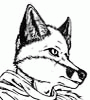
A couple people were interested in my process, so I tried to remember to take progress shots this time. Here's a general overview of how I've been painting digitally lately; hopefully it will be useful or at least interesting to people!
For years and years I tried to paint in Photoshop, but just couldn't get it to turn out in a way I was happy with. I decided that this year I was going to start tackling the Photoshop Painting hurdle for realsies, and got some excellent advice from fellow artists. I also decided to try painting in PS as if I were painting with oils--that is, create an underpainting to get value range, and then paint over that with colors. I find that not only is it easier to tackle shading (value) separate from color (hue/saturation), but it's easier to play around with colors and come up with more dynamic color schemes.
It's not the fastest way to work, but this method, combined with tips from friends, has made coloring in Photoshop something that I actually enjoy now x) No more heavy reliance on Screens or Multiplies, woo! I'd also *highly* recommend James Gurney's Color and Light book to anyone who wants to get a better grasp on, well, color and light.
The last step is where Photoshop really shines--lots of tweaks with Adjustment Layers, and texture layering with various stock resources I've collected over the years. My favorites are Lost and Taken (www.lostandtaken.com) and Mayang (http://mayang.com/textures/).
At any rate, enjoy!
Category Artwork (Digital) / General Furry Art
Species Unspecified / Any
Size 900 x 1264px
File Size 394.1 kB


I think it's the value ranges I use, and the blending style? I tend to blend it so that values/colors "bleed" into each other, which is a very marker/watercolor/translucent media look, as opposed to a more hard-edged blending style like you might find with an oil painting, or the high contrast of an oil painting. Also, I texture the pictures so that they have a lot of paper texture, which enhances the "translucent" look, making it look more like marker.


Wow, this is great! :D If you still have problems with painting in PS, try checking out http://www.ctrlpaint.com/. I've heard it's got great tips!

I don't have the patience for Illustrator, even though I know it would do me good! I learned to ink with Microns and brushes/brush pens, and try to apply that technique to my digital work. I don't like inking in Photoshop, because the brush responsiveness just isn't fast enough for how I ink (I like to use quick strokes, as opposed to slow ones..the faster you move the brush, the less jitter you get, and the better "flow" the line has). I love the inking tools in SAI, TVPaint is great, and Sketchbook Pro is decent, depending on the look I'm going for. To practice.. do practice strokes every day, varying line weight and curves, practice straight lines, practice consistently weighted lines.. find ink illustrations you admire, and try tracing them or replicating them! Try a variety of tools; some will just feel more natural to you than others, and eventually you'll find your favorite program/brush/pen/whatever :3
Hope that helps!
Hope that helps!


I only used CS5 for a 30 day trial. I couldn't get more than one image to pull up at a time. I friend help me get a legal copy of CS6 and talk about being impressed. Before that, I was using Corel Painter 11. I still use it for things. My only complaint about it, is that it gives a white hue, when I paint out side of a layer. The icon that you see was my frist CS6 image.
I map Brush Opacity to Pen Pressure (in CS5+ you can do this by clicking the little icon next to Opacity in the top tool bar when you're in Brush Mode), and make frequent use of the Eyedropper to select various color ranges for blending. I try to work dark to light, but save my darkest and lightest values for last.

Comments