 FA+
FA+
805
Views
Views
106
Favorites
Favorites
Category
Artwork (Digital) / All
Species Unspecified / Any
Size 500 x 623
File Size 525.7 kB
Report this content
More from TevionBee


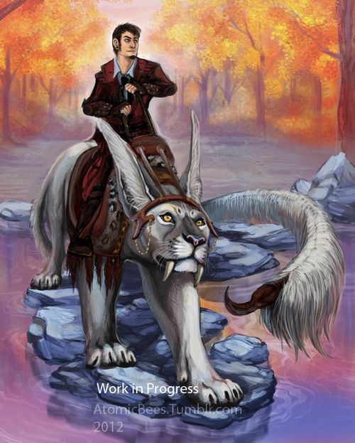
Still havent named this piece. haha...ahhh but I am back with an update on this! And another plea for critiques and tutorials and other stuff. Pleaseplease guys <3
Curious about the first wip? its over here > http://www.furaffinity.net/view/7791101/
Curious about the first wip? its over here > http://www.furaffinity.net/view/7791101/
Category Artwork (Digital) / All
Species Unspecified / Any
Size 500 x 623px
File Size 525.7 kB
Everything you just said. *brofist*
:D
Actually the inspiration came from Avatar. I started this the day Legend of Korra came out. I am so in love with Naga. And Kitty somewhat reminded me of Naga.The psd has been sitting dormant for a while. I figure its time to actually finish this.
:D
Actually the inspiration came from Avatar. I started this the day Legend of Korra came out. I am so in love with Naga. And Kitty somewhat reminded me of Naga.The psd has been sitting dormant for a while. I figure its time to actually finish this.


Redline? So I can see what you are seeing?
Lineless is working with shapes and silhouettes. Play with thumbnailing techniques and you get an understanding on how to apply that to a painting technique. Well that's my way. A more common way is lined sketch + shading. And shade till your lines are no more. I find it's easier when you work with high contrasts shading. Again, this is just me. xD There are so many ways to do it yourself. Its practising and finding out what works your way. And how you see the way your pencil or colours move on paper. Or digital canvas 8D omg so many ways.
Lineless is working with shapes and silhouettes. Play with thumbnailing techniques and you get an understanding on how to apply that to a painting technique. Well that's my way. A more common way is lined sketch + shading. And shade till your lines are no more. I find it's easier when you work with high contrasts shading. Again, this is just me. xD There are so many ways to do it yourself. Its practising and finding out what works your way. And how you see the way your pencil or colours move on paper. Or digital canvas 8D omg so many ways.

I still really love this piece~
Funny thing is, I was listening to autumn sounds while browsing around this morning and it really matched this piece.
http://youtu.be/Onantz2TYq4
I might have mentioned in the first WIP that it might look cool to have some color weight on the very bottom, like a dark, cool, blue that's darker than the stones... maybe to illustrate depth in the water...


I really love where this is going! It's got a really fantatsical-yet-realistic air to it. I dig the color scheme too, and the character designs. As for critique, I think this piece could benefit from pushing the contrast a little bit in the foreground and reducing it/adding some atmospheric depth to the distance. Right now, although the really bright colors of the trees are pretty, they're a little distracting and make the piece feel a little flat...it's hard to tell the distance. Other than that, I might recommend shrinking the back of the cat-creature thing a little bit, it kind of looks a little big for the perspective. I'm better at showing what I mean, hope you don't mind a quick and dirty edit-- http://img.photobucket.com/albums/v.....suggestion.jpg (just upped the contrast up front, brushed in some light pink over the back to reduce the contrast in the back/create atmospheric depth, and shrunk the back leg of the animal). I think this piece is really on its way, you're doing great and I can't wait to see it finished!
I try to reply to critique with something to show. I will have to annoy you later with it. But I have to say, this has been a huge help. Thank you very much Mery. I actually applied this is another painting I was working on.
Firstly, I can see how making her butt smaller works. That will be the first thing that will happen when I find the psd. (Moving computers around) I have been having trouble spotting perspective and working it into backgrounds etc. Which is partly why this picture came up, to practice that.
If you'd like to see the painting here > http://fav.me/d5g1fn9 It's a lot more contrast in the shadows then this picture. But I was able to focus on what you were telling me. I would love for you to critique me further or any opinions on the direction I am moving in?
Again, thank you very much Mery for helping me out!
I'm glad you found some of the suggestions useful! :> (It makes me really happy when artists on FA are open to critique, it can make for really great discussion and learning for everyone. So thanks for being one of those awesome artists that understands the merit!) Anyway, that other painting you've been working on looks great! I can see those techniques in play for sure; When you push the contrast and shadows like that, and reduce it in the background, it really helps lend to a sense of depth and light. Nice work :> I'd be more than happy to give more input on this as you go forward with it, it's shaping up great already and I'm excited to see where it ends up!

I think this is compose beautifully. To not sounds completely useless though....perhaps a little more of the orange tree reflection in the water...you eye is draw to all the orange and if you places a few more orange spots in the foreground it would help draw you eye all around....though yeah that is my only suggestion....it's really awesome!


Comments