 FA+
FA+
327
Views
Views
15
Favorites
Favorites
Category
Artwork (Digital) / Anime
Species Unspecified / Any
Size 1280 x 769
File Size 241.5 kB
Report this content
More from snow-mishibari
")


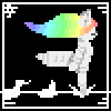
ok! so for my manga, im going to color it two different ways, one is like the one on the left, and one if like the one on the right.
so, im asking which one you guys like better? i have seen mangas that show a lot of detail in coloring and such, and some that show not much at all
so, of course, to do the one on the left it would take a lot more time. .___. sooo im at a stand point here XD
but i wanna know how im going to do this before i end up line arting and such for the manga ^^
also, this example is my OC Kai ^^ he is a wolf demon XD
Category Artwork (Digital) / Anime
Species Unspecified / Any
Size 1280 x 769px
File Size 241.5 kB


lol i like how the first one looks too, im just worried it might become too..time consuming for each page to do it like that ^^ since the shortest manga chapters i have seen are at least 20 pages of actual content (aka not cover pictures, and fillers) say i have 4 chapters in a book and thats a lot of coloring! XD

I think the right would be great for each page of the actual manga and than the left for covers, chapter art and 'spreads' or those special pages that aren't for the story itself but more Canon type images :3 you have wonderful line working skills and I think showing both off in the manga would be a plus for you :3

Personally I like the one on the left better.
If you are able to get a good ways into the manga it would be really good to take advantage of lighting effects. If you start out with a lineart and suddenly need lighting, it would be a bit harder to put emphasis into a characters facial expressions for more intense moments.
But thats just me
If you are able to get a good ways into the manga it would be really good to take advantage of lighting effects. If you start out with a lineart and suddenly need lighting, it would be a bit harder to put emphasis into a characters facial expressions for more intense moments.
But thats just me
ah, good point. Some scenes to need to have shading to them to get the feel of the mood, like if a person is shocked or surprized, i almost never see any shading, but if they are angry, its generally heavily shaded
im researching by reading lots of manga to get how things are done and such o3o/
im researching by reading lots of manga to get how things are done and such o3o/


Do I have to choose? ._.;;
I personally prefer the style on the right, BECAUSE I read a shitload of manga
And most of my favorites are colored like that.
However, I actually really like when the artist colors like the one on the right regularly...
...but during intense scenes, the art changes to the style on the right.
But that's just my input :3 <3
I feel like I got my directions wrong >.<;;


The one on the left is definitely nicer. However, without that as comparison the one on the right is still very good. Now, depending on how much longer it takes to do the art like the one on the left, it might be an overall better idea to do it like the right one. Speed versus quality.
Although my initial idea was that you could mix both, I thought about it for a few moments and think that's a bad idea. If you decide to use the art style on the right, with less shading, then mixing in the one on the left would give a comparison. If everything was shaded like the right one is, it would be harder for a lot of people to notice the missing detail. But if you have one page like the one on the left, and the rest like the one on the right, it becomes more noticeable. But that doesn't mean having some scenes more detailed is a bad idea.
Honestly, if it takes you three or four times longer to shade like the one on the left, I would strongly suggest sticking to the style on the right. For a half hour sketch, four times longer is only two hours, not too crazy. But if you have a full page which might take six hours, as a short estimate...now you're spending an entire day on it. Of course, as you do it you'll get better at it, so it might get easier and quicker as you continue doing it, but it'll be a -lot- more time investment up front.
Just my two cents.

Comments