 FA+
FA+
579
Views
Views
51
Favorites
Favorites
Category
All / Animal related (non-anthro)
Species Unspecified / Any
Size 900 x 638
File Size 145.5 kB
Report this content
More from Capreolus


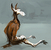
Got a new tablet (Intuos). The angle sensitivity opens up loads of new ossibilities. Thought it need getting used to...
...Expect overworked junk like this until I do. Or until I'm bored of using all tools at once.
...Expect overworked junk like this until I do. Or until I'm bored of using all tools at once.
Category All / Animal related (non-anthro)
Species Unspecified / Any
Size 900 x 638px
File Size 145.5 kB


I don't think it looks overworked at all, and in fact, zooming in, I love seeing all the strokes. It makes it even more vibrant and active a piece. Usually one wants to minimize a view as it tightens things up. Not here. Well done! LOVE the browns and blues. One of my favorite color combinations.
Thank you for the wonderful reply!
Yes, i noticed my works tend to look worse when small. It's because I usually start out without a plan and my compositions end up random and lack the punch (unlike yours; I'm in awe just how strong you manage to make your works with very basic means).
I think too much locally, in terms of brush strokes, details and textures and totaly forget the work as a whole. It's rather evident and i'll put the effort to learn.
I honestly don't know what you mean in regards to my work, but I find this stunning. I can see what you mean in regards to working really zoomed in. With digital media, it's much easier and much more seductive to work on small areas up close. Still, when I zoomed this up, I liked what I saw. It didn't get rougher, it got more interesting. I also think it works as a thumbnail. The whole thing's enticing.
Thanks again!
Though I wasn't refering to working zoomed in - i work zoomed out most of the time (i try to).
"I honestly don't know what you mean in regards to my work, but I find this stunning."
If that wasn't sarcasm, let me rephraze. :]
Unskilled artists usually make the mistake of getting boggled down in details and forget the work as a whole, resulting in the work falling apart in a mess of useless detail. That's my problem. While your works look great as unified wholes and and compositions are strong and right to the point.
Wow, looking over my own sentence again, it makes almost no sense. What I meant, and what you seemed to have been able to glean from my clumsy words was that I don't see exactly what you're saying in regards to -my- work and that I find this piece of -yours- stunning. :"D And no, there was no sarcasm, just lousy writing. I usually reread everything I post before posting. I obviously didn't. Sorry about that.
Thanks again for kind words about my stuff. I don't think you were bogged down in this and while the composition is simple, it works to my eye. The bird's head along with its negative space forms a sort of swirl, or even a very rough sort of ying-yangy kind of thing. As to possible anatomical mistakes (I don't know enough about birds to know) the colors, care and detailing more than compensate, at least to me. We're all our own worst critics, and I am certainly an example of that.
Regardless, thanks. I'm looking forward to seeing what you do next.


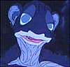
the eye... is... amazing... if you need anything to redeem this pic in your mind pick the eye. it is very lifelike, as close as it can come with digital media. you can actually see the distance between the surface of the eye and the iris itself, not many people can accomplish that. people are usually stuck slapping it on the outside of the eyeball, most of the time myself included when I give them irises at all. amazing dude.
</praise>
and quit bashing on yourself man, you rock hard.
</praise>
and quit bashing on yourself man, you rock hard.


Wow, Thankies! :]
I didn't notice the eye was effectively framed by blue until you mentioned it. I have alot of learning to do.
Scanned textures of stuff (like that dirt on its beak) used as papers give that "i'm not digital, I'm not digital, I'm not digital" impression. Well, cause in essence, the textures ain't.
I didn't notice the eye was effectively framed by blue until you mentioned it. I have alot of learning to do.
Scanned textures of stuff (like that dirt on its beak) used as papers give that "i'm not digital, I'm not digital, I'm not digital" impression. Well, cause in essence, the textures ain't.
In case you do: pastels and oil pastels are most responsive to paper texture, right next to "Blunt chalk". Digital watercolor too, but it works and looks differently.
You can control how responsive a tool is by changint the Grain value - less value = more aggressive texture. (Often mine is set to 13 - it seems to map the entire texture value range to the pressure range the closest and still allows for covering when needed.)
It's fun. Sadly, Painter has a fixed amount of memory it can devote to papers, so you can either have a few large ones or lots of small ones in your library. Switching libraries is an option, but it can become tedious, esp. when you're at the high of inspiration making a very swoosh-swooh-splat type of loose/expressive masterpiece.
You can add papers to custom toolbars same way as brushes, for quick switching between your favorites.


Comments