 FA+
FA+


244 submissions


mostly just a test to see if something would work
it did
kinda
it did
kinda
Category Artwork (Digital) / Doodle
Species Exotic (Other)
Size 1280 x 1280px
File Size 265.3 kB
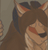
Remember how I said I don't want to spam the fuck outta ya saying how amazingly inspiring your coloring is. And how that textured brush look you have going on here makes everything here just look so ffffffffffffffffffffffffFFFFFFFFFFFFFFFFF IT'S BEAUTIFUL. Especially that sun, or massive flare being held by an invisible creature. Or red moon? Anyways that magnificent red thing just balances so well with the red shine around her eye. That in tandem with her striking green eye, just forces your attention to be sucked towards her expression.
Well this image is just too damned impressive for me not to.
Well this image is just too damned impressive for me not to.
asdfasdf i still don't know what to say
that is indeed a seen back there. or rather it's a red giant star. the planet in the 'project frost' world had its orbit disrupted when it's planitary system drifted too close to the system of that red star. Sol, their sun, was a relatively dim and cool star and their planet was very close to it to be in the habitable zone. Surtr, the red giant star, tugged their planet slightly out of orbit so it's on this funky pattern as their Sol revolves around Surtr. it makes life on that pretty shitty.
red a warm colors are pretty much my favorite to use but i try not to spam them. i am actually trying to learn how to not rely on such saturated colors so much. it's pretty hard.
asdf that was a ramble but i don't really know what else to say
THANK YOU I AM GLAD YOU LIKE THIS
I now know more about the solar system effecting project frost then the one currently causing that accursed sun to rise outside of my window.
I'm trying to figure out how to get my colors some saturation, everything I do always looks muted beyond belief. I mean saturated colors are just fun even if they often end up not actually making any sense.
Not that things not making any sense ever got to me in what I draw, I mean I draw walking talking dog people, so might as well turn them into neon light shows AMIRIGHT!?
But seriously the only colors I can even work with at all are like brown and grey. HIPPIES REJOICE IT'S BROWN AND GREY THE MOST LIVELY OF COLORS.
Anyways, you're quite welcome, now me and this fine hunk of man Mr. Captain Morgan here are just going to go fix that shed already so you just have a nice day or something. I think it's day, but the sun won't answer me so, you'll just have to take my word on this one.
It was an idea drawn from watching the science channel too much. space if fucking terrifying, bro. sorry i am dumb x:
If you're having with color satuaration you might consider 'keying' your pieces. simultanious contrast will help lots too. placing a bright red next to a dull saturated green will make it appear much brighter. if i'm doing digital i typically matte everything with the shadow layer first. that shadow layer will usually be a dull complement of whatever the majority of what ever color the character/scene is. this can really help you get bright colors
one of my professors has so good things to say about color. he is pretty smart and not a dummy like me x: http://petercullum.com/studio/studio.htm
When it comes to contrasting the colors, a while ago I royally fucked my brain sideways by doing that on accident, so I kept trying to balance these two colors that only looked different due to their surroundings. . . .BUT THEY WHERE ALREADY THE SAME COLOR. Seriously this just flabbergasted me for a good half hour. Also doing the shadow layer first is a really interesting idea. I always start of with either highlights, or a midway base color, and then do shadows over that.
I shall have to read about this whole keying thing through the link provided though because I have no clue what keying is.
Unless people key paintings like they key cars, but dragging the end of a key across a canvas doesn't seem like it'd help the colors out to much.
Seriously thanks for all the tips and pointers nig. Unless keying a painting is dragging a key across it, THEN GEE THANKS FOR ALL THE TIPS.
doing the shadow layer first makes stuff hella easy for me. all i have to do is map where i want the shadows to be and then bring the tones up.
having a color wheel helps you pick contrasts a little easier. whatever is on the other side of the wheel is the complement. i really want a pantone swatch booklet but those are like idk $500. :(
keying is like... balancing colors a certain way in your image. it's a little hard for me to explain because i'm not a professor of this kind of stuff and it's all just habit now. basically if you want a brilliant image you can't just match the values on everything. you might have to make things darker or lighter than they actually are when you are painting from life. if you want red flowers to stand out you are going to have to key down that green feild etc.
it's not really like keying cars :P
i try to be helpful i guess. sorry if i'm hard to understand.
worst comes to worst just draw and make everything you draw look as awful as possible. :B
Hey don't worry my scribbles can't get much worse. But I'm almost positive I understand what keying is now. If I can actually employ is another question entirely.
However for shading, I'll have to try doing the shadow layer first, even though I rarely ever plan out the actual lighting so that should go over as well as me and Mr.Captan Morgan fixing the shed.
However for shading, I'll have to try doing the shadow layer first, even though I rarely ever plan out the actual lighting so that should go over as well as me and Mr.Captan Morgan fixing the shed.
Comments