 FA+
FA+
1332
Views
Views
47
Favorites
Favorites
Category
All / All
Species Unspecified / Any
Size 949 x 1280
File Size 241.8 kB
Report this content
More from ZomaCaius


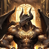
so yea i noticed today that is suck a big cocksicle with drawing Environment art . so i just cropped it down and also i removed the axe-halibard because it's not the middle ages .
Second i moved the arm to the side i think it looks better this way.
also changed The red to blue because it just didn't fit.
Also there is in my scratch gallery a background 1980-1320 for some people that wanted a background from this, so don't mind that.
Leave a Posstive, negative or cretique in the comments below.
Thank you for watching.
Category All / All
Species Unspecified / Any
Size 949 x 1280px
File Size 241.8 kB

I just want to point out a few things that I think would kick-start this to an even better status:
1) On the left side, it looks like your background is overlapping with itself, and it's a bit jarring. Smooth that out, maybe kick back the strength of the background a little bit so it isn't competing for attention with the figure itself, and that'll look great. As it stands now, that overlap is catching my eye, and all the strong black dots are making me go a bit cross-eyed. I almost want to look away, rather than look into it more.
2) While I love the lighting in the torso and the highlights, it feels to me like the cloth, legs, and neck didn't get the same level of love. It's so close to being awesome, and it's falling just short. If I had to name the one to fix, it's definitely that white cloth. It doesn't feel like it has any depth or fold to it, that it's just there to be there. Give it some shadow, maybe a shadow that falls on the legs in some fashion as well, and it'll feel like it belongs and help tie the bottom half of the character to the top.
Those are my two cents. Beyond those points, this is looking great. Interesting design to the character, solid shadows and highlights, and is just very easy to read.
don't worry from critique, i learn. So yes your first point i tend to agree with that and fix it probably tonight . second : i wanted the chest to be the focal point, if i detail everything the same way which i the painting will look weird. I did this with the legs to experiment with it, and it looked just really weird.
I will actually just try to shade it again, perhaps i did something Wrong who knows.
But thanks for the critique it was helpful
I will actually just try to shade it again, perhaps i did something Wrong who knows.
But thanks for the critique it was helpful

All I have to say on this is fantastic, it's like a Turian version of the collector armour.
I agree with Deriaz on the back ground and lighting. But I would like to add to that.
A little more detailing on the flesh and cloth wouldn't go amiss. The maw/jaw line seems a bit shallow, as thought he is missing his lower jaw. It just seems as though his mandibles are shielding nothing.
You seem to have lost interest in your shading detail around the abdomen and reverted to flats, it darkens the image and detracts from the concept.
Sorry if I seem a little over critical, but you did ask for it >>
Just as the above comment i can take critique don't worry, and again as on top i will work on the background and (again) again as the top comment the chest was the focal point shading the whole body looked really odd to me,
and i suppose it's true that i somewhat didn't put much effort in the background. but as i stated i suck at drawing Environment i tried but utterly buttery failed , the cloth is odd too the global lighting doesn't affect the cloth which indeed is weird .
I will surely look after the points that i was given and actually work on them.
anyways i always appreciate critique it's actually more useful to me when people just comment

Comments