 FA+
FA+
11061
Views
Views
523
Favorites
Favorites
Category
Artwork (Traditional) / Muscle
Species Vulpine (Other)
Size 1069 x 1500
File Size 2.45 MB
Report this content
★
More from djdarkfox


")


Listed in Folders


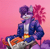
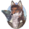
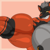
Here's Andre again, the big red muscle fox that belongs to my dear sis Elly 
He's having a can of the own energy drink creation that newberrychucks,  acommonmisconception and I created, it's much better than Monster Energy, even if those taste quite well too. ;P
And as you see, not only the background shows mountains, but also Andre himself shows a mountainous peak to tease the viewers while he cools down by enjoying his drink. ;3
It's one of the few rare pics I actually drew on A3 sized paper (around 11,8 x 17 inch / 420x297mm)
I will never use sketchpad paper again though, no matter if it is actually quite sturdy, it is a real marker ink killer XP
Anyways, I used a photo reference that Elly showed me so I could draw the mountains so they'd look like actual mountains =3
The picture is completely copic-marker-colored, only the white highlights and clouds are done with acrylic paint. ^^
I hope you all like it
Art is © to me, djdarkfox
Andre is © to newberrychucks
Claw is © of Elly, Eric and me ;p

He's having a can of the own energy drink creation that
newberrychucks,  acommonmisconception and I created, it's much better than Monster Energy, even if those taste quite well too. ;P
And as you see, not only the background shows mountains, but also Andre himself shows a mountainous peak to tease the viewers while he cools down by enjoying his drink. ;3
It's one of the few rare pics I actually drew on A3 sized paper (around 11,8 x 17 inch / 420x297mm)
I will never use sketchpad paper again though, no matter if it is actually quite sturdy, it is a real marker ink killer XP
Anyways, I used a photo reference that Elly showed me so I could draw the mountains so they'd look like actual mountains =3
The picture is completely copic-marker-colored, only the white highlights and clouds are done with acrylic paint. ^^
I hope you all like it
Art is © to me,
 djdarkfox
Andre is © to
newberrychucksClaw is © of Elly, Eric and me ;p
Category Artwork (Traditional) / Muscle
Species Vulpine (Other)
Size 1069 x 1500px
File Size 2.45 MB
Listed in Folders


Also von Monster, bis auf die grüne, schmecken alle anderen nicht wie der klassische energy drink. Musst mal das violette und das neue gelbe mit Tee probieren, das hat nichma Kohlensäure und schmeckt ziemlich gut. Und die Vitacola schmeckt zwar nichmehr so gut wie zu DDR Zeiten (waren ja Glasflaschen damals ;p) aber ich hab bisher noch keine gehabt die nach plastik schmeckt, keine Ahnung was für ne abgestandene Soße du da hattest XP


Well, then... once again I shall start my usual comment, also known as “ReptileCynrik's comment short stories”! *grins*
I hope, you'll enjoy what I have to say. After all, such artworks deserve more than just ten words...
COMPOSITION:
It's a more or less "classic" poser composition: the character fills the format from his head to his knees. I might have even cropped the picture a tiny bit earlier... but this would have cut off his nice thighs in the end. I guess, it's alright this way. What I really like is how the character and his huge, wide torso fits into the format - considering that he's holding a can in his right hand and is drinking from it at the moment. I also like the little wooden stump in the lower right corner - this was a good idea to position the character's other hand (and he has something to rest on... to retain his balance). ^^
CHARACTER:
The most important part: the character “Andre"! This is just a handsome, beefy, strong, tall fox... and you know what? The most interesting part is his golden hair! ^^"
Yes, his hair makes him unique and very cool. You drew this hair very softly and plain awesome... there is no room for error or mistakes. Beautiful hair! And it's very special, 'cause it's another, additional colour the reddish and brownish colours.
You are working with very nice and well done gradients here. This is very special, 'cause you're using traditional media, after all. Well done!
I especially love the little highlights, which - much better than in other of your recent artworks - give us a VERY good impression of "fur". Yes, especially the highlights work splendid to create the illusion of a furry texture.
Also, the veins looks REALLY good this time! I always have problems with veins... to make them a part of the body and NOT just some "snakes crawling over the body". But you do this very well.
THE VERY BEST PART: his face. This is just a very pretty, nice face... a magnificant look in his eyes... such a nice, friendly face. ^____^ Wonderful.
DETAILS:
This energy can offers a great opportunity to add some nice details and you did it! I like the simple, yet very effective and convincing logo/symbol of the brand... and you also thought about adding the "0,5 l" information on that can! Cool!! I'm not quite sure, if half a liter would really fit into that can, but... I would be an annoying asshole if I would give you any bad stars about this aspect! XD
Thinking about the "Red Bull 0,5 l" cans... yes, it works. You got it right! ^__^
BACKGROUND:
The background is one of my favourite parts! You wrote that you've used a suggested photo? Yes, I thought so. The landscape is beautiful, convincing and most fitting! You've painted this little lake, the trees and most of all: the mountains very believable and just pretty awesome!! Simple, yet effective.
The background is perfect and it does NOT drag away too much attention, either! ^^
ADVISE:
Just two questions/advises for you:
1) I'm sure that the scanner spioled the orange fur a little bit or my screen is too colourful... because I would have welcomed a little more variation in the orange colours. I'm really sure that you DID add some lighter orange or some yellow here... but the deep, bright orange is so strong, that it "eats up" all the other colour variations. Surely, this is just because of the scan.
2) I'm still convinced that the little water drops on the can should NOT have any line art! Some of the drops really look like bulges, coming out of the metal. Sure, most of the drops look really convincing... but there are some places, where I think... the black line art should've been exchanged with grey or white. Especiall the one drop on the UPPER side of the can... between nose and index finger... this looks like the metal was bulged up a little bit.
Sorry for being such a nut right now... nothing personal. ^^" The drops still look amazing... but since I'm always trying my skills on such effects, too... I'm also looking very closely here!
Maybe, you can avoid ANY black line art, when drawing water drops.
The MOST convincing drops are below the can... slowly dropping down. Really well done!
So then… this is it! Another large comment for a masterpiece like that.
Thanks for sharing!!!!!!!!

Wegen den kurzen Haaren und dem hellen orange Ton hab ich Depp den André zuerst mit 'nem anderen Charakter verwechselt xD *facepalm* ...aber ehrlich, die kurzen Haare stehen ihm gut. ^^
Viel besser ist aber immer noch was unterhalb der Augenhöhe zu sehen ist. :D
Der gebeugte Arm sieht aus dieser Perspektive schon hammerhart aus xD aber man mag sich mal vorstellen wie der Peak von der anderen Seite aussieht. *schwach wird*
Ich möchte wetten er hätte kein Problem damit die ungeöffnete Dose so in der Hand zu zerdrücken, ^^" allerdings wäre es schade um den guten Energy Drink. :D
Nun was mir dann noch aufgefallen ist...und da achte ich sonst eher weniger drauf... ist sein "Hinterteil". xD
Ehrlich, soetwas durchtrainiertes sieht man selten ^^ aber es sieht auch nicht schlecht aus. :)
Zwar würde ich ihm so wie er da steht gerne um den Hals fallen, aber selbst dafür wäre ich zu hibbelig. :D


Rawrrr, now there's another amazing work of muscle fur art by you Darkfox bro :) You've done a really good job at capturing Andre over the years and, in my opinion, this is one of your best works on him. I say this because I love the color in it...so bright and it really captures everything that you wish to show in it very well :) I love the overall look in this from Andre to the background and the softness to the colors of the background making Andre stand out even more. This big wolf also must try Claw at some point, hehe ;) You also know that I'll be cheering Andre on when he competes as a pro heavyweight bodybuilder in the fox division :) Again, amazing work on this bro and you never stop amazing me with what you do with your awesome artwork :)

da kann man sich gar nicht dran sattsehen, gut gemacht muskelfuchs <3
den energydrink würde ich gern mal probieren, mal sehen was der bringt ;3
die detailarbeite bei den muskeln und venen ist wiedermal atemberaubend, da fängt mein herz zu schlagen an
und die lichtverhältnisse sind auch hammer, ich liebe deine bilder <3
den energydrink würde ich gern mal probieren, mal sehen was der bringt ;3
die detailarbeite bei den muskeln und venen ist wiedermal atemberaubend, da fängt mein herz zu schlagen an
und die lichtverhältnisse sind auch hammer, ich liebe deine bilder <3


Finally I get to comment on this wonderful Andre piece. n///w///n...
You know my love for shredded abs, and you really drew a rock-hard washboard here. <3
And on details, I think I see some evolution in your work from here. >w<... Remember during the time we were talking about vertical-headed biceps? >w<... heehee, here I see that (L), and my GOD, what a display of ripped arms indeed. >///<... showing one huge flexed bicep, and another on stretched, while showing how massive the tricep is underneath.
The hair is sleek and clean, like in our revisions, thanks for that <3.. and that look on his face is enticing, to say the least.
Of course, how could I forget the beefy rippling butt. XP... purrr, that is quite a sexy focus of this beefy picture. And speaking of sexy, his red underwear makes him look very much so.
As for the background, my goodness, a beautiful lakeside with forests and snow-topped mountains. n/////////n... Andre surely loves that type of terrain <3
Thank you very much for this pic, dear bro. I absolutely LOVE it!

Comments