
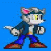
I took this basic doodle of Mikey G and colored him three different ways. The first is just darker/lighter colors shading and then shaped with the smudge tool, the second is shading with the dodge and burn tools and then smudged (I've never used the dodge and burn tools before and despite their bad reputation it looks alright), and the last is gradient shading and looking a bit more like what you're used to from me. Which do you like best?
Personally I think I like the first one best :)
Personally I think I like the first one best :)
Category Artwork (Digital) / General Furry Art
Species Housecat
Size 1280 x 455px
File Size 182.2 kB
First. Softer colors, softer on the eyes. The way your shaded it also looks unique to me. Standard dodge & burn and gradient shading is overdone and becomes boring. #1 is most unique, gives a better indication of your personal technique and it has that slight "painter" charm that goes along with soft shading and pastel colors. I like it a lot. I think it suits your style well.
I like that 2 has a bit more highlights but they're a bit too shiny. 1 is nice and subtle but still has detail, 3 is a bit flat in comparison.
1 has a nice traditional feel as well.
hmm, I used to use dodge and burn... but the weakness with it is you only get one shade from it.
now I only use it to make a highlight/shadow across several colors like say stripy socks. I get more subtle shading by using soft brushes at low opacity and smudging to smooth together. I have no idea what 'style' that is but is what i do :B
i love the shading on the first one, but it doesnt have the highlights that the other two do, but i do like the texture of the second one. i think if you combined elements from all three it would look good, mainly the shading colors and technique from the first, the texturing from the second and the highlighting from the second and third. but overall it looks like you are being really shy about the highlights in general. thats just my opinion tho.
I like how there are several CG tutorials that say the dodge and burn tools are the "shading and highlighting tools." It makes me laugh how many people think that that's the easy way out. Anyway I wanted to try it out to see if I could make it look good at all and I don't think it's that bad, but I totally understand that there's like...no color in it at all and is like deadening things up XD
The second one caught me with the brighter highlights and overall color. I wanted to say something about how the contrast is greater, but I dunno if I'm still seeing it. I have been known to have mental lapses during stressful points in my life. *cough* finals *cough*
Just kidding, I'm perfectly sane. Or so Chef Brian told me. (If anyone gets that reference, they get a cookie. Maybe two cookies.)
Just kidding, I'm perfectly sane. Or so Chef Brian told me. (If anyone gets that reference, they get a cookie. Maybe two cookies.)
I do like the first one... though the second one had me second guessing, so to speak.
I like the highlights along the fur in the second, then again, I like the dark shading in the first.
Tough call... I'd say the middle one. :3
Still a good job all the way through each one!
I like the highlights along the fur in the second, then again, I like the dark shading in the first.
Tough call... I'd say the middle one. :3
Still a good job all the way through each one!
You know what makes and breaks each coloring of the kitty for me? The back ground color. Are you asking which goes together best or which is the best color on the kitty directly?
If we're talking the whole thing then the middle one.
If we're talking the kitty then the last one gets my vote.
The first one comes off too dark on my screen, which could be MY screen but as I have learned the hard way that counts even though it's pretty much impossible to control.
I could tell you why I think these things but since I just stumbled upon your gallery I'd rather not over whelm you with my babble. =3

 FA+
FA+















Comments