 FA+
FA+
350
Views
Views
19
Favorites
Favorites
Category
Artwork (Digital) / All
Species Rhinoceros
Size 859 x 1280
File Size 108.2 kB
Report this content
More from SharpDressedReptile


A character drawn in one of my sketchbooks, scanned and painted digitally.
Category Artwork (Digital) / All
Species Rhinoceros
Size 859 x 1280px
File Size 108.2 kB


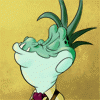
He definitely looks distinguished! His body language does not betray his clothing, the left arm and slight forward thrust of his body giving him a sense of formal dignity. He also has an expression that, while formed into a disinterested one, is not exactly a 'disinterested' one in relation to the elements of his design and in practise. There is even an allusion to 'proper tea-handling' with the way he holds his cigar.
His clothing really does make him (adapting the expression). I see colours that do not clash hard with the way that they are muted and otherwise neutralized, the dull yellow going with the muted magenta, helped by the black in the pants and brown in his shoes (two of these colours present in the cigar). These muted, neutral colours are also present in Sir Rhinosworth himself, what with his shades of grey. Even the blues of his glasses are muted, yet the glasses are sufficiently small, avoiding causing a discord with the general colour scheme. In fact, the only thing that truly causes a clash in the colours is the whites of his shirt, yet, given how white shirts are used in formal clothing, this is understandable. Never the less, I wonder if the 'muting' of the whites would benefit the colour scheme.
The actual forming of the clothing is another matter. The tassel of the fez appears to be 'held up' artificially, yet I can see how positioning the tassel this way would give the viewer a proper sight of the tassel in a way that does not get in the way of Sir Rhinosworth's body. His clothing is definitely classy, what with his choice of a coat, handkerchief, whatever is that yellow thing directly under his neck, dress shirt, pants, and 'formal shoes.' (Seriously, the way you put these elements of different 'conventional formal outfits' together subverts the viewer's expectations while giving him his own type of class.) The way his coat is unbuttoned both alludes to a fat figure and tells more about his clothing, more specifically, how long is the yellow thing around his neck and the fact that he wears suspenders. The strain around his buttoned button only adds to the suggestion that he is fat.
On miscellaneous features, he definitely gives the impression of age, what with his small eyeglasses, the 'sagging' of certain areas of his face, and his suspenders. The formal clothing itself may also be a contributor of this. Even so, he uses his age in a way that simply augments his class. Design elements of which I am fond are the hairs on his head (my favourite element of his body!) and the curves that make the front of his face (his horns, nostrils, front of the upper jaw and frown). In all, Sir Rhinosworth is a very handsome character with details that reward the one who looks closely.
P.S. Seriously, what is the name of the yellow thing under his neck? I like how the yellow thing looks.
Comments