 FA+
FA+
2796
Views
Views
104
Favorites
Favorites
Category
Artwork (Digital) / Human
Species Unspecified / Any
Size 567 x 546
File Size 43.5 kB
Report this content
More from CaptainGerBear


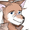
Haven't been doing much illustration lately because I've been working on my game in all my spare time. It's really exciting to see progress on this sort of thing, and there's no doubt in my mind that I will finish it. When exactly, I'm not so sure on. Anyway, a certain somebody makes a guest appearance as a hidden character, and this is his in-game portrait.
Critique is Welcome
Critique is Welcome
Category Artwork (Digital) / Human
Species Unspecified / Any
Size 567 x 546px
File Size 43.5 kB

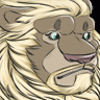
Wow, that isn't at all what I was thinking but you convinced me.
I motion that Grant is either Evil Abraham Lincoln or an Asian eating werewolf.
I particularly like the chest and body fur, is that a texture or a brush?
The collar itself doesn't look right to me, let me explain briefly. As it looks, the turn in the collar behind the next suggests that it may bend or twist in some way. The position of the front and back portions of the collar segments suggest to me that the collar goes through Grant's neck.
This is how it appears to me as I look at it more, after the initial "It's cool" 5 seconds.


Something strikes me as odd about his left shoulder. I think maybe it's a combination of the lighting on the photo texture you used and the angle you're showing him at. It makes it look like what should be his shoulder is either a weird growth on his arm, or a lump on his back. Though I can see you emphasized the end of the large neck muscle where it joins the collarbone for some definition there, it just doesn't seem to *quite* do it.


ALL RIGHT!!! Great to see Grant again! Ive been in withdrawal. I love that he always is slightly shifted into lupine form, the pointed ears, the longer canines and that certain glint in the eyes. Werewolf powers definitley would come in handy as a bouncer. Will we be seeing more of the bulky snuggly guy in the coming year? (PLEASE PLEASE PLEASE????)


Neat experimentation with overlaying textures on a rendered image; I think though that the texture of the hair on his body differs a bit too much with the way you did his hair. It's two different styles (organic vs stylized), so people see the hairs on the body and get the misconception that you may have traced over a photograph of a body.
The trick with using textures is to make it look natural, as though they belong. Generally, that means either working over top of the texture layer and "massaging" it into the image by blending it into similar objects, adding cast shadows, tone changes due to angle changes (this is more for jagged things like rocks), all that jazz etc.
An example of where this could be applied would be his left cheek: you've put some curly stubble on his cheek and there's straight sideburns right beside it. Having a black outline for the sideburn probably would have worked if there was no texture, but since there was a texture the black outline creates an odd divide. One way you could have done the hair to make it work better with the texture would be to create a custom brush that has multiple dots (this creates several lines) and lets you brush in something yourself that looks like strands of hair. Don't overuse it though or it'll look like a barbie doll.
Also, on a different topic - it's a good idea to have a good balance of hard vs soft edges, especially with shadows. If the edges are all hard, something ends up looking a bit artificial, but when the edges are soft, things will look like putty. I see that the forehead already has some hard edges shadows from the hair so that's good, but it would have been nice to do so with the shadow that the nose was casting. (closer shadows/larger angle changes have harder edges) His right cheek looks like it might be protruding out to the viewer a bit with the soft shading.
end wall of text. :O

Yeah, good critique man. I think the only thing that I could really suggest as "in addition to" would be to do some manipulation with those textures. It might be a pain, but it would make the photo textures more believable if you "tooned" them up a bit. Like drawing darker lines over all the body hair.
The technique works pretty well though, using photos for textures. It might be better to use them only to supplement the coloring. Harsher shading, almost to the point of rivaling the lines and outlines, would make the blend between the photo textures and the stylized line art a little easier to accept.
Of course it all depends on what you're trying to pull off, (critique disclaimer) but those are my two cents.


I must not have been paying attention when these were posted. >.< Oh well, better late than never.
About the only thing I can say about it is that the hair texture looks out of place. The stuff on the shoulders looks a little stretched and that on his chest is a little flat. I'd try doing some warping of the texture using maybe the liquify option in Photoshop (if that's what you're using) to get a more 3D look to fit on the illustration itself. Lines on the bandages looks too bold and mismatched with the texture itself. Artistically speaking, looks good. Practically speaking, not very aesthetic.
About the only thing I can say about it is that the hair texture looks out of place. The stuff on the shoulders looks a little stretched and that on his chest is a little flat. I'd try doing some warping of the texture using maybe the liquify option in Photoshop (if that's what you're using) to get a more 3D look to fit on the illustration itself. Lines on the bandages looks too bold and mismatched with the texture itself. Artistically speaking, looks good. Practically speaking, not very aesthetic.

Comments