 FA+
FA+
2246
Views
Views
114
Favorites
Favorites
Category
Artwork (Traditional) / General Furry Art
Species Hyena
Size 1067 x 800
File Size 156.3 kB
Report this content
More from hbruton


I'm still working out how I'm going to handle the originals and the prints. The two pics were painted seperately so I can either matt them together or seperate. Either way, the originals will have a window cut out beneath to drop in the phrases. The prints will be seperate similar to the look below. I still have to work out the colour and text and such. The one here is a test. I might also do up some jumbo prints that have both images together like they are below. Still thinking......
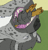
Each pic is 8 1/2x13 acrylic on illustration board.
Each pic is 8 1/2x13 acrylic on illustration board.
Category Artwork (Traditional) / General Furry Art
Species Hyena
Size 1067 x 800px
File Size 156.3 kB


I don't think it's a matter of complimentary that is causing visual problems, but the contrast of the two colors next to one another that is making the colors pulsate (I'm probably going to make my color-theory teacher cringe by buthering the vocabulary here. I never completed the class... I hated painting endless swatches of colors.)
An example of complimentary colors doing the same thing:
http://www.rochesterschools.com/web.....ontrast_02.jpg
I know you really want to use the opposite colors, but being that they are exact negatives (complimentary colors, but same relative value), it's a bit uncomfortable to the eyes (in this medium at least.) I remember doing projects based on this same principal in color theory class.
Perhaps if you don't wish to adjust the text colors (either in values or hues), maybe an outline of black or white to break up the edges?
Maybe it doesn't look uncomfortable when printed, but I also noticed as soon as I saw this that it was difficult to read/look at on the screen. I felt shy to bring it up though.
Of course, this is just my two cents. I'm just just the casual observer. Other than the color intensity thing, they look wonderful. :D
Hi Art. Thanks for the advice! And never feel uncomrtable about offering it. Even if I don't agree I'm certainly not going to get pissed at you. My trusty room mate works in graphics and layout so we sat down tonight and redid them. I had to lose the opposite colour thing but they look much better now. The original colours printed out badly so they went out the window.
Well, I know that some folks are very protective of their creations. So when it comes to trying to critique on something so "simple" as color choices, I worry about how folks will take what is typed and how they will respond. I (usually) never mean to be mean or sarcastic or "superior" in what I type. I just offer what I can in the hopes that it's more useful than just "I like it!" (which isn't always a bad thing either... but I understand that when we post things on FA, we often do it to get a little more feedback. But maybe then again you use FA to show off and let folks know what you've got available too and use it as a portfolio. Maybe you're not looking for critique. Hmmm.. I'm still rambling? Wow. See, this is where I get into trouble. I can't stop typing! :D
Also, since it was just a color issue (and color is not my strong point), I didn't know if my concern was valid either.
Sorry to hear that the color scheme didn't work out. But hopefully the new design will be stronger with whatever decision you have made.
Also, since it was just a color issue (and color is not my strong point), I didn't know if my concern was valid either.
Sorry to hear that the color scheme didn't work out. But hopefully the new design will be stronger with whatever decision you have made.


Comments