 FA+
FA+
ARTSTUFF: Basics Are Okay
16 years ago
General
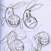
Anyare commented on my recent upload, "Luanne", about my use of color.
i was going to respond in comments, but this seems generally useful, so it's going here in a journal entry.
while there is no One True Way to Art (and i thoroughly believe this notion), there are approaches that are basic and pretty bulletproof for helping you get to point B from the blank canvas.
Or, as the pulp saying goes: there are a million stories in the naked city, here is just one...
- While complex compositions are fun and interesting and can add lots of drama and so on to your subject matter, there is nothing wrong with the tried-and-true, slap-it-in-the-center-of-the-image "bullseye" approach. It worked for the Renaissance, and it can work for you. It might be dull and predictable, it doesn't scream "CLEVER" or "EDGY", but it does work just fine. Don't feel bad about using this approach. Just understand what you're doing and own up to it.
- While complex color schemes can be dazzling and evocative and give all kinds of layered emotional cues and whatever, there is nothing wrong with a good ol' monochromatic palette. Picasso had his Blue and Rose Periods and so can you. Black, white and grey? It's not gonna to rock the boat, but at least it's okay if you are stumped for how to proceed. This approach will encourage you to get your contrasts right, if nothing else (color can sometimes distract from paying attention to your lights and darks).
- Staying on color: after the monochromatic approach of just picking shades of one color for everything, the next basic thing to do is to use a color and it's complement. If your image is mostly green/red, yellow/purple, or blue/orange, or whatever subtle shade you like/it's opposite on the color wheel (easy in photoshop to figure this out), then it will work in the eye. This is biologically sound, this is how eyes work: they buzz when a color is next to its opposite. So if the eye buzzes, the brain buzzes and the picture is more interesting than not. Sure, and of course, you can come up with complicated color systems that work, but if you're not confident with your colors or unsure what to do, just squint your eyes, see what the overall hue of the image is, and base your colors around it and the opposite hue.
For instance, the recent "Luanne" image has a lot of stuff going on, but if you squint your eyes and blur it together, this is mostly a yellow/purple(lavender) image with a little nudge into the orange/blue. There's not a lot of red/green going on. Using complementary colors is a basic color scheme that will almost always work, particularly if you pair up the warm color with high lights and the cool color with low lights (shadows). It's not the best nor only way to go, but it gets the job done.
- Pick one near, strong, well-defined light source, off to the side. This tip is about contrast. The more light sources you have, the more you have to consider overlapping shadows, the colors of each light source and how they interact with each other, etc. it can get -very- complicated, especially if you're rendering something shiny or transparent. Also, having the light to the side makes it easy to show depth of field: the near-ness or far-ness of something. Light that is head-on will tend to flatten contours and blunt the feeling of curvature (think of the way camera flashes work, ugh). Hazy light, rod lighting (like fluorescent tubes), will give you more diffuse and complicated light pathing. With a simple uncomplicated light sourcing, and considering what is exposed to that light and what is facing away from it (in shadow), your forms will seem more solid, than following a formulaic approach, if that's what you want.
- For portraits, working at eye level is easiest. The profile is the easiest to render, then the frontal, then the 3/4 view. I think I already mentioned this before, but yeah. You don't have to worry about symmetry when from the side, there's no concern of left/right balance. With straight on, you don't have to worry about perspective and occlusion. With 3/4 you have everything to worry about. And then if you go tilting the point of view higher or lower than eye level you suddenly have three-point perspective to worry about, oy vey! Again, there are often a zillion reasons to show a particular point of view, i'm only mentioning the hierarchy of bossmonster difficulty. But if you're just needing to crank out the image to see the object and aren't trying make any particular point, the side view is the simplest way to go, because there are fewer variables to consider.
- When drawing humans, old and/or craggy/textured/lopsided is easier than young and/or smooth/flawless/symmetrical. Because there is more information and marks per square inch, there are more points of reference to self-correct the placement of each mark. It's like a connect-the-dots drawing, or 3-D computer graphics: the more polygons, the more dots, the more dpi, etc. the more information in general, the more you have to work with, the easier it is to pull the image together. There is more room for error. Wrinkles are your -friends-, seriously! When you have fewer lines, each line matters more. When you have more lines, each line matters less. If you are nervous and unsure about drawing human faces, start with making a picture of your grandma or someone like that :) Also, your grandma -totally- loves that kind of thing and she will bake you cookies. I think it must mean something that the people most easily depicted are also those with the least amount of time left to be with us; GO MAKE PICTURES OF ACTUAL PEOPLE MUCH OLDER THAN YOU ARE, etc. It's a great introduction into drawing human beings, if you're unsure about your skills with that.
((Also, fuckin' youth-oriented culture is 1) dumb and 2) soul-sucking and 3) overdone... yes, we understand that physically idealized sexiness is physically ideal and sexy... okay, now what other notes can you hit? more pin-ups, really? Is that what the world needs more of right now? Anyway, rant aborted...))
This notion of complexity being easier to suggest than simplicity has a corollary in the next tip:
- Work bigger than you want the finished image to be viewed! It doesn't matter how much bigger, not really, but a good thumb-rule is 1/3 bigger (sure, why not). This is because if you work at -actual- viewing size, then every mark you make totally counts as is. However, if you work larger, you have room for more marks, so there is more wiggle room, and more space to suggest the "perfect" line with a cluster of smaller "imperfect" lines. These will come together and tighten up in the end when you finally reduce the image to the final viewing size.
You can see this in action if you ever see how large the professional corporate comicbook pages are compared to the final print size. If all you ever see is the finished reproduction, you might think of that finished image as the model for how they are drawn, but it's not so! Stray marks and fudging errors are minimized in the final reduction and will make your work look "neater". The opposite is true too! If you work smaller, and then enlarge it at the end, your work will look "cruder" and more rustic. Take your small 1"x1" pencil drawing and blow it up to 5ft square and it will magnify the texture and rough edges. This makes sense if you think about it. So work bigger than you think! Unless you -want- a rougher edge to things, then work smaller ;)
- Use optical reference (not drawn reference). There is absolutely positively no shame to be had in using reference. In fact, it's the only way to understand the forms you are trying to draw. Nobody is born knowing what a four-stroke engine looks like. Drawing one from imagination without previous exposure to it will look totally different from drawing one from imagination -after- actually seeing one.
You don't have to be a slave to your reference, but at least expose yourself to what your subject actually looks like before making it up, and your work will be more credible. Think, for example of what those funky medieval drawings of tigers looked like when it was clear that the artists were going off of written descriptions and not first-hand observational reference. Or, for another example, before the invention of the camera (which lets you visually stop time) nobody -really- knew what horse legs looked like in full gallop(!) And so if you look at pre-industrial depictions you have these kind of fanciful shorthand solutions of animal legs and, yeah, you understand that you're looking a horse, etc. but it's like comic book "zip" lines, it's just a visual code for the real thing: the pose doesn't really match to any particular portion of the horse's gait.
Check out this Durer image from the 15th Century and then this discussion of motion in the arts -after- the invention of the photographic process allowed for people to have a reference for what motion really looks like. Remington's paintings of horses in motion are very much informed by being familiar with photographs showing what horses in motion actually look like.
This does not mean that reference is the only way to proceed, because without people making shit up, we wouldn't have the manticores (which came from depicting "tigers" based on inference and second-hand information) or heraldic lions or the awesome cave paintings of Lasceaux, or the Minoa bulljumpers, etc. In the absence of reference, you're gonna make shit up and sometimes that means Awesome Stylization will happen. But if you aren't trying for stylization, if you want your fingers to look naturalistic, then go -look- at what fingers look like. Take a picture of your hand in that position, actually holding whatever it is you're supposed to be holding. Have that photo next to you when you draw and refer to it. It's not going to make you lose face to do this, it's not going to cheapen your work, you aren't going to lose cred or Magic Art Points, or XP or whatever.
I've noticed in the fandom there sometimes seems to be a kind of ZOMG I'm So L337 I Don't Need Reference machismo thing, and that's just silly to me. If you need to know what something looks like, go look at it. Reflections on glass and plastic are complicated. Anatomy and perspective are complicated. Nobody can expect you to have an innate understanding of this stuff, and using reference can only help.
No, there is nothing magically kewl about using reference, but just the same, there is nothing magically kewl about -avoiding- it either, and if anything, when you do have to make up your subject matter (because there is no reference available) then you'll have in your mental toolbox an understanding of subjects that at least resemble what you want, and so your work from imagination will look more informed and credible.
uh.. that's all I think of off the top of my head.
Oh yeah, texture your surfaces before you even start drawing and you won't have to worry as much about the floating-in-a-void thing, or having the white of the paper sometimes making your stuff look "thin".. it automagically imparts the texture and richness of information to the finished piece.
This was totally part of the Academic way of working, dating all the way back to da Vinci. Slather on some kind of color and then get going with your image. It is one way to help unify your colors and the image as a whole, too. There are other ways - of course there are.
So calm down about spouting aesthetic dogma; I know. These are just selected tools for those who might not have considered any of it before. Find what works for you. Holy shit I feel like I have to half-step and qualify every point of advice :D You folks are grown-ups, you know how this works. Anybody who tells you there is only one way to do it is deluded or trying to sell you something (typically membership to some "Good Art" club), or both.
Okay, I'm rambling.
[EDIT] Oh yeah, I forgot one: hold up your image to a mirror, while it's still in progress.
Any errors in your anatomy, proportion, or with perspective will dramatically jump out at you as obvious. It might not even be clear what the problem is, but you'll think "Hmm, that nose isn't quite right" or "The chair looks right one way, but flipped it kinda looks wonky."
You can get so used to seeing an image one way that you become blind to errors. This trick will quickly help you get a sense for where they are.
This is easy to do in Photoshop (flip horizontal) or with a mirror. try it!
Especially digitally this is useful because you can flip the image and continue working on it, then flip it again later, etc. In the end, if your picture and the mirror image both feel okay to your eye, then it probably is okay :)
THE MOAR U KNO
Now go start a band.
ok, nevermind
TRUE STORY.
Thanks.
It's easy to avoid by piecing pictures together from multiple references. An arm here, a leg there, a hand from the end of your very own arm... The composition and posing should at least be original, I think, unless the work is only intended to be a study.
I think drawing without references is a really useful skill to master, so you can whip out a little something in a sketchbook while you're sitting around with friends or strolling the halls of a con or something. That's probably where the other half of the obsession comes from. It's certainly not the only way to draw, though.
As it is I'll need to reread that at some point to get more from it. I feel very strongly that there are a lot of amateurs in the arts (many young, but not all) who learn by imitation rather than honest to goodness basics and though they get a lot from looking at others art and practicising, there's something to be said for the learning aspect of art. This would be a good place to link someone too.
It's something that I lacked for many years, and I hadn't realized that my art had stagnated in a terrible state simply because I had never taken the time to learn. Like many student-level artists, I could produce a beautifully rendered drawing, but because I lacked basic knowledge the underlying sketch would have deformaties and distortions so bad it ruined the picture even though I had the fabric and glass just so.
Now my drawings are nowhere near as complicated as they were and flipping through my gallery one might not think I have the ability to render well, but only because I am forcing myself to perfect my sketching techniques and the bases rather than the textures, and when I feel I am ready I will be back to doing full-blown peices.
I meant the people that learn by just drawing, with or without using refs (properly or not). I feel that everyone would benefit from, if not an art class, reading over an art book or two on the theories. I've yet to meet a person who did so seriously and didn't get better as a result.
I believe there should be clarification in the references, however... seems like a lot of people reference off of other people as opposed to referencing from life or photographs of life... It's fairly clear but I get the idea that someone will misconstrue it.
I'm going to bookmark this.
Ideally, direct observation is the best way to go, but using a photograph is okay if nothing else is available.
Well, it did make me realised how long it'd been since working off real models and how much short-hand I'd developed, but still! I think there're a lot of affordable resources out there.
Unfortunately I think it's going to be lost on most people here.
I've been wondering about this kind of thing forever, what other artists' approach is to the subject.
This is really great, thanks for posting it
Thanks for the teaching. :3
-Zoid
Now is one of the times I wish I could fave journals like this...
and yes, i wish i could fave this and i've bookmarked it already, just like
what everybody else said and done.
Thanks for this!!! ^_^
thank you :)
-drawing ugly melty people is way more fun, thought slightly harder, than drawing "beautiful" people.
-i find a lot of the time people put their subjects of hilter, or over use the "rule of thirds" so much that sometimes a straight on centered shot is more shocking :/
(same with the colour dealy)
-references, just like in writing, if you rely on them too much you just end up plagiarizing
kudos on a pretty sweet post.
I'm not an artist and never will be (informed choice -- other interests) but I acknowledge greatness when I see it. It starts with recognition of the basics, and this is a certain small kind of great.
I ended up setting "Flip Horizontally" to the shortcut ctrl+alt+command+z, so I can slam my hand down and do it on the fly. Makes me feel like a digital badass. c:
I should work on opposite colors soonish
The mirror trick i was told by a friend who was studying art at "Les Beaux Arts" in Belgium (
Please, write a book. I would buy a hundred copies D: <3
I think that's because most people never get explained how they can use references to learn, and not just to copy.
I refused to use any reference for along time too, not because I felt too good to use them but rather because it looked like cheating to me. It seemed an easy way to get things "right" in a difficult picture with little research or exercise. Having a very poor art education I thought copying was all you could do with a photo. Much later I realized that copying from a to get some difficult detail right and studying a photo trying to understand the shapes, the light, the composition etc. are two very different things. I think a lot of beginning artists do not have this difference very clear.
This is a great journal, I do wish I could favorite it.
TONGUE OUT
:P
ROCK OUT
but even the burly guys i draw are 'physically idealized' to a huge degree, just in a different sense!
the only thing i'd add (or maybe this is just in my case) is that touching things helps. like, passing your fingers over your wrist or squeezing and tugging the skin around to reveal the bone structure underneath (as an example)