 FA+
FA+

That New FA Layout
6 years ago
General
(inner thoughts)
https://i.imgflip.com/3kwkrg.jpg
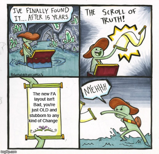
I suppose if I just try it out for a little bit I'll get used to it. Been so used to using classic mode for so damned long that it feels awkward changing it to this... "Modern" that them kids call it.
~Drayk
.
..
...
media only screen and (max-width: 480px) section:first-child, .section:first-child {
margin: 10px 10px 0;
}
That second 10px..is indeed shifting things 10px to the right. I hadn't noticed much though, as all the content still aligned well.
I've not seen any other glaring issues on desktop or mobile so far. I wonder if some of the issues are down to caching.
well, switched to the beta shape for a while now, and i like the new layout, definitely nice and modern.
but yeah, need to get used to it .
but in a way on another, you will put your scaly butt on it =P
No it's just because it's new and new is bad.
Everyone is so quick to judge and demonize "change," they never give it a second thought. I actually like the compartmentalized feel of this style...just, I wish the ads weren't so prevalent. lol
You can say, "These changes would never have been okay," but...are you in the position to really give that response when you don't work for FurAffinity? When you don't know what processes they deal with behind the scenes, or what other factors they have to determine?
Just like me, you are a commenter, a user, nothing more. You are allowed to voice your opinions, but at least try to see outside your own peripheral at times. The world isn't so narrow when you take into account other aspects besides your own. If you don't like FurAffinity's new look/feel, revert back to the old, or...leave? No skin off the rest of us, honestly.
And for clarity, I'm not intending this response to come off as "defensive," or "overly aggressive," I'm merely replying with the same energy as your first sentence was input: "I'll say to you what I've said to many over."
But the point is, as a web dev I know that anyone with any degree of skill or experience wouldn't have greenlit any of what we have in this beta.
A user, nothing more? Yeah y'know, that thing that a website lives and dies on? You make it sound like the userbase is irrelevant. And if FA wants to stay alive it needs to pay attention to what it's users are saying and thinking. Okay not everyone has criticism or feedback that's particularly helpful or constructive. But I've been seeing plenty myself.
If I left the site then my opinion/feedback wouldn't be out there, and if everybody left, nobody's opinion or feedback would be out there, and the site would die. Okay a mass exodus is a pretty strong message that something is completely fucked, but if it gets to that point it's probably already too late.
One thing that baffles me about a lot of the response I've been getting is that it seems wrong of me to want/expect better. Wasn't IMVU buying up FA supposed to help funding? Whatever happened to that? Why has this beta that's been in development for so long so lackluster in so many aspects? How is a site layout and UI that's about a decade behind the times somehow better than the modern equivalent? Who have they hired to do all this? Because the new layout/UI is the work of a bedroom developer, not a professional.
It just feels all completely backwards. Yeah the site is shinier and "modern" but without any of the actually meaningful stuff modern website design is supposed to bring with it. It's all flash and no substance.
Well, whatever the people behind FA want to do, they do...it's their "baby" to take care of, so to speak. All us users can do is offer up criticism, critique, concern, and hope that something is done.
and for this, it's not incredibly clear that this text box is meant for adding comments, it's just placed here without any real visual context or identification besides just being above the comment section.
other than that, *change* is the ux designer's means of keeping a job. so whatever.
editing/hiding comments is more sensible. I don't see the smiley window anymore, though.
also why does the Recent Journals window extend all the way to the bottom of the comment section? it just weirdly cuts off comments on the right by its width.
just noticed it shows your user title up top by your name too now
In essence, "It could be worse..." It's a mantra I try to live by, as if I always got upset over issues, I'd be living quite the angry life. lol