 FA+
FA+
660
Views
Views
47
Favorites
Favorites
Category
Artwork (Traditional) / Portraits
Species Housecat
Size 600 x 784
File Size 949.6 kB
Report this content
More from Bluari


Listed in Folders


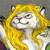
A little badge for this year and to try out some new things. This one seems much nicer than the vampire version ;3. Even though I screwed up the writing againnn(always make sketches before the final drawing. Always).
I used the flowers I've been gathering for few years now. It's lovely how intensively they smell of honey c:, there's just nothing like real materials and what can be more real than flower petals 83.
I solved my little problem with fear of laminating *drum roll* decoupage glue! Pity some of the forget-me-nots got soaked and little visible now. But first cats had jumped over the fence, as we say here ;D Next time will be better.
Zis is how it looks completely finnished :> http://bluari.tumblr.com/post/83802.....is-years-badge
*****Just a reminder that commissions are open if you'd like to peek into my flower box ;3 I have hell lot of rose petals.**********
colour pencil, watercolour, flower petals, markers
♥ Thank you for your comments and faves! ♥

Telegram art channel ♦ Instagram ♦ Twitter ♦ Ko-fi ♦ Gumroad

For other art profile go to

♦  ♦
♦ 
Category Artwork (Traditional) / Portraits
Species Housecat
Size 600 x 784px
File Size 949.6 kB


Stunning texture you got out of the petals! I simply must try this sometime... You ever given thought to making fantasy novel covers? ^u^ One of the most gorgeously rich, natural browns that I've ever seen.
(An art tip I got once is that you never should have a yellowish-brown or a bluish-brown in a picture without either red, orange, or reddish-brown to anchor it, because otherwise it looks like baby poop... for some reason a good red-brown can fix everything. And the gold you used in the lettering really sets off the soft lilac colors very well!)
Having just started reading up on those color theories that say Red, Yellow, Blue and Green are the 4 primary colors, neither of which can be combined. It hurts my head - all these color models! The "Yellow, Red, Blue" model and the "Cyan, Magenta, Yellow" model and the "Red, Blue, Green" model, and how red and blue are just yellow mixed with cyan and magenta (and therefore the primaries look cool together because the yellow in everything makes it harmonize, and why those purple/magenta/cyan/spring-green combinations look so strange is because they're the only colors with no yellow in them).
Technically, because of the way our eyes are set up, we don't see color the way we think we would. Because of the way light signals travel through our eyes, we can see Magenta (even though a purple and a red together should be patently impossible - purple is the highest wavelength and red the lowest), because neither of them cancels each other out. But we can't see a reddish green or a yellowish blue, because even though they exist, when you see yellow it shuts down the part of your eye that sees the blue. So a more accurate color wheel would have four quadrants - red, green, yellow and blue - with all the opposite colors adding up to pure white in the human eye. Owww...
Sorry! It's a lot to keep in my head at the moment!
I must simply draw some charts of how these color wheels change proportions in regard to the other wheels! Damn!
Haha, because it's nature of the flower petals! ;3 What's natural is always most rich and beautiful.
I've been thinking about many things, but first I should learn to draw humans like this xp I find human skin extremely difficult to colour/paint....
:3 useful tip, thanks, maybe I'm not that bad colourist after all ;D
That's where art and science comes together. I like the abstract art pieces where artists been using those visual tricks.
Definitely, it's hard to imagine x3
Ah, well... my compliments to god, then! They still look gorgeous. You knew where to put them.
Do you know what actually does help with human skin? If you're trying to draw white people (which is every fantasy novel ever written), start with a thin layer of blue underneath the other colors. Then layer on the red, then finally the peach. See, human skin is translucent, and you can sort of see the veins and stuff underneath, which gives skin a slightly luminous quality. It's a tough texture! But it is rather more forgiving than fur, since the texture doesn't have to follow a direction, only a 3D contour.
Your colors are fine! I wish I could apply color to paintings like you... but like they say. Those who can't do something teach it instead.
Color is volatile! I'm trying to instruct an amateur artist friend, and he just came back with a color experiment... "When I put a yellow highlight on his ultramarine blue fur, it doesn't look right." Yeah, yellow and ultramarine blue are opposite colors to the human eye, we can't perceive that color at all. >~< I feel bad for him for that...
Science in art... yeah, I could never do that chemistry stuff, but it gets amazing results! International Klein Blue, it's like staring into the void :3 Or the pieces where the artists exploit things like retinal fatigue, to create colors that don't exist. derp:
I'm a huge fan of the color field painters; one of my favorite artists is Ad Reinhardt, who basically "abolished" painting. http://www.moma.org/collection/obje.....bject_id=78976 His final years of his life, all his paintings were five feet square (abolish the difference), a perfectly symmetrical tic-tac-toe pattern (abolish composition), and had multiple shades of black painted in the squares (abolish light). There's no gloss on the canvas, so they suck up all the light that touches them. It's a black hole of a painting. They provoke people into cosmic terror, not because they speak, but because they're silent. Color!
I'll draw the color wheel diagrams soon, just to have them around <3

Ooo, this seem interesting! And now I'm talking just about the technique, not to mention the beautiful art made with it.:) I love art that is not plain, and is in contact with the viewer even with shapes, textures and used materials. The flower petals are a wonderful idea.:) Aaand I have one question - is it wood in the background or some texture that you purposely created?
c: Thank you.
Oh yes, me too. The very flat watercolour+pencil style is less and less satisfying.
They are a beautiful creation of nature. I also collect butterfly wings when I find any, don't happen often x3. Maybe finally I will be able to include a decent number of them in a nice painting.
It's also petals which became brown after drying, glued onto flat brown watercolour background. I see it looks exactly how I wanted - like a background but not as individual petals ;3.
Comments