 FA+
FA+
392
Views
Views
9
Favorites
Favorites
Category
Artwork (Traditional) / All
Species Unspecified / Any
Size 645 x 478
File Size 212.7 kB
Report this content
More from Fable


Late Christmas gifts for Kay Fedewa and her boyfriend, Jay. Kay made up a kooky pink fox while at AC 2007 that we got a kick out of, so I used a rough facsimile of that canine and surrounded it with some of Kay's favorite pets (she loves exotics, especially tiny adorable ones). A hedgehog, a rat, and a mouse.
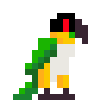
Jay asked for a red panda in a Napoleon outfit (his company logo features a red panda). This one was quite a challenge as I rarely sketch or paint such complicated clothing, period outfits even less. And I tried to style it like some of the old master paintings of the favorite tyrant. Just for grins, I made the costume more red than usual. It looks more visually interesting than the straight black jacket Napoleon usually wears in most his portraits (it also happens to be Jay's favorite color). Quite a challenge, good practice with tenebrism.
It's also especially challenging to get a blended look on such a small surface with such quickly drying paints. ARG! I promise it looks better in real life, the scanner lit up the gloss and made it look like I neglected to paint areas (dern highlights). A little touchup work in Photoshop helped alleviate the worst of it, but it's still pretty bad. It also looks far duller on the comp than it is in real life.
Acrylic paint, matte medium, gloss medium, silver and gold paint on 3 by 2 inch bristol paper rectangles.
Category Artwork (Traditional) / All
Species Unspecified / Any
Size 645 x 478px
File Size 212.7 kB

Comments