 FA+
FA+
3324
Views
Views
205
Favorites
Favorites
Category
Artwork (Traditional) / General Furry Art
Species Kangaroo
Size 480 x 660
File Size 59.2 kB
Report this content
More from rickgriffin


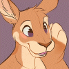
I wanted to see how the coloring would look without complex lighting
Category Artwork (Traditional) / General Furry Art
Species Kangaroo
Size 480 x 660px
File Size 59.2 kB


Something about her collarbone and the right side of the hood looks odd to me. The right side of the hood, by color, looks like it's lacking a contour that's present on the rest of the piece, while a contour line that appears to be her collarbone turns to look like the missing contour on the hood. It's just a really awkward area, not sure what that line is supposed to be. The earring looks like it's in her ear instead of on the lobe. The contours of her breasts also have an unnatural curve, her left breast especially appears to have some sort of odd lump in it at the top of it. Just a few issues here and there in the line work and the perspective and the figure.
On the plus side though, the color work is really well done, I love the subtle colors in the shadows. The muzzle is really nice, the soft values in her fur are really convincing.
On the plus side though, the color work is really well done, I love the subtle colors in the shadows. The muzzle is really nice, the soft values in her fur are really convincing.
Ah, I see it now. Okay.
Sorry if I was being hyper critical about anatomy and proprotion, just thought I'd give some constructive criticism, since you were asking for opinions. Meant no offense. The color work is really good, the shading and color creates a very natural lighting situation. I just could help but notice those flaws in the actual line art.
And I am still curious about the seemingly missing contour on the hood. Is that intentional, am I misinterpreting that contour line, or what?


I am happy you decided to color this one, I liked it ever since you posted the sketch! :)
I think it works perfectly with the style of lighting you chose, the shades of a cooler color tone look really good and add to the "rainy" feeling of the image. Can I ask which program you used for coloring it?
I think it works perfectly with the style of lighting you chose, the shades of a cooler color tone look really good and add to the "rainy" feeling of the image. Can I ask which program you used for coloring it?

 faint
faint


Comments