 FA+
FA+
15475
Views
Views
1018
Favorites
Favorites
Category
Artwork (Digital) / All
Species Unspecified / Any
Size 1260 x 990
File Size 1 MB
Report this content
More from Rukis


Listed in Folders


<<< PREV | FIRST | NEXT >>>
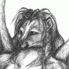
I figured it was about time I posted the final cover design for 'Legacy', my upcoming novel.
Legacy chronicles the story of Kadar, a golden jackal born into the Red Lantern world, and his struggles with family violence, an antiquated caste society in which people can be owned and traded as commodities, and his own desire to be a better man. It's set roughly 20 years before the events of 'Red Lantern'.
The novel is now up for pre-order! - https://furplanet.com/shop/item.aspx?itemid=856
Category Artwork (Digital) / All
Species Unspecified / Any
Size 1260 x 990px
File Size 1 MB
Listed in Folders


the armor took a whole hell of a lot longer, actually. . . other than improving on my bounce lighting (which I'm attempting to do, but it's tricky) I'm not really sure what more I could have done to it. Over-texturing it wouldn't have really improved it, it would've just been unnecessary noise.
This is hardened leather armor, functional, not ornamental. Like so - http://s50.photobucket.com/user/Sie.....-2308.jpg.html It wouldn't have folds except in a few places, like at the joints of the pants (since the leather there would not be hardened)
It's also meant to be old, so a glossy texture wouldn't have looked right on it, especially considering it's from a sand-blown environment. I think a lot of people are used to seeing Renaissance Festival outfits or cosplays, so they assume all leather is glossy. It's not if it's being used.
Also, maximizing detail throughout in a piece is not ideal. You want to draw the viewer's eye to the right area, not confuse it. In the armor, for instance, the eye is meant to be drawn to the highlighted areas, that's why there's more detailing done there (with the texture and buckles and whatnot). You don't want the viewer's eye caught up on areas that are meant to blend into the piece, like in the shadowed areas of his legs.
I'm actually very prone to over-detailing, so knowing where to pull back is something I've been trying to work on.
Not offended in the least, just explaining my choices. Especially seeing as you mentioned you were an artist yourself, some of the knowledge I've gotten from other artists like  Myenia was really useful to me when she shared it with me, so I feel the need to share it as well. Over-detailing is a common pitfall, and it's something I'm particularly prone to. I was also once prone to highlighting in ways that created overly-reflective, 'shiny' surfaces . . . another really common mistake I see popping up a lot in digital art (primarily because of overuse of the dodge/burn tool) so I wanted to explain why, in this case, using flatter matte shading was an intentional choice. Not laziness :P This piece actually took around 40 hours, and I don't think more detail will fix the issues it has. As usual, my biggest mistakes were in composition and lighting, and roughing up the armor some more with a texture brush isn't going to change that.
 Myenia was really useful to me when she shared it with me, so I feel the need to share it as well. Over-detailing is a common pitfall, and it's something I'm particularly prone to. I was also once prone to highlighting in ways that created overly-reflective, 'shiny' surfaces . . . another really common mistake I see popping up a lot in digital art (primarily because of overuse of the dodge/burn tool) so I wanted to explain why, in this case, using flatter matte shading was an intentional choice. Not laziness :P This piece actually took around 40 hours, and I don't think more detail will fix the issues it has. As usual, my biggest mistakes were in composition and lighting, and roughing up the armor some more with a texture brush isn't going to change that.
The actual image is much longer on both sides of what you see here, and pulled back more to reveal the whole sun, as well. It's cropped here because in the original layout, it's designed for a book cover - https://furplanet.com/shop/item.aspx?itemid=856
If I'd planned better, I would have preferred the composition to be less character-heavy towards the left. But again, that unfortunately happened primarily because I had to split the image down the middle for the book layout. There was a way to do it 100% right, I just couldn't make it work within the confines of the image I knew I had to design for the template I had. Common problem with book covers. Happened with this one, too - http://www.furaffinity.net/view/15299242/ (that image, btw, VERY good example of how over-detailing can ruin a piece)
If I'd planned better, I would have preferred the composition to be less character-heavy towards the left. But again, that unfortunately happened primarily because I had to split the image down the middle for the book layout. There was a way to do it 100% right, I just couldn't make it work within the confines of the image I knew I had to design for the template I had. Common problem with book covers. Happened with this one, too - http://www.furaffinity.net/view/15299242/ (that image, btw, VERY good example of how over-detailing can ruin a piece)


Nope, the book's not complete yet, there's another whole novel's worth to be posted.
I don't know if it will ever be sold on Amazon but you can find it here - https://furplanet.com/shop/item.aspx?itemid=856
I don't know if it will ever be sold on Amazon but you can find it here - https://furplanet.com/shop/item.aspx?itemid=856


I think this is one of my favorite piece of art that you've made. I just LOVE how you draw expressions, body proportions, the realism of the animal's faces, and especially how you draw the fur and color the images in. I'm sure you get praise all the time but it's been a while since I've seen your art and I totally remember why I'm watching your page. Keep up the beautiful work! You're one of the best imo! ❤
Comments