 FA+
FA+
20721
Views
Views
1571
Favorites
Favorites
Category
Artwork (Digital) / Fantasy
Species Western Dragon
Size 1280 x 466
File Size 109 kB
Report this content
More from Narse


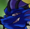
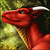
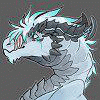
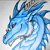
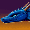
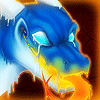
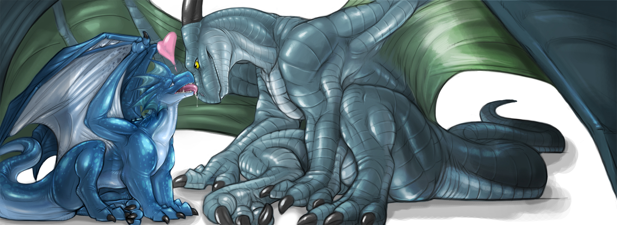
I started drawing this as a doodle...but it quickly grew into a massive image.  Larus Is an amazing dragon and always is there for me, I love him to death. I don't post alot of clean art, I might try doin it more often.
HighRes : http://www.athusworks.com/temper/laruslove.jpg
 Larus Is an amazing dragon and always is there for me, I love him to death. I don't post alot of clean art, I might try doin it more often.
 HighRes : http://www.athusworks.com/temper/laruslove.jpg
Category Artwork (Digital) / Fantasy
Species Western Dragon
Size 1280 x 466px
File Size 109 kB


And btw, I don't say 'porn addict' lightly. I don't mean that I LIKE porn, or that I have more of it than your average person... I mean I literally will go out of my way to get it, even when doing so would otherwise impede my normal daily functionality or put me at risk of breaking rules/laws.


Aww! So cute! Amazing as always, Narse!
I'm a huge fan of your clean art, since I love referencing great artists to my fellow peers for inspiration. I can't do that with your naugty pics, however. :(
I would absolutely love to see more clean stuff like this! *looks at you with big, watery eyes*
I'm a huge fan of your clean art, since I love referencing great artists to my fellow peers for inspiration. I can't do that with your naugty pics, however. :(
I would absolutely love to see more clean stuff like this! *looks at you with big, watery eyes*


Narse.. You have no idea how much this picture has moved me, from start to finish. Today was a tough day with college. and you totally changed my outlook on others and for things to come. Your a amazing friend a brother (from another mother =)) I'll always be around to lend you a hand. Don't let others art bring you down when you draw, its outright amazing and stunning in Detail and emotion. But this piece is one i will cherish always. Love you <3


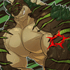
I love the relaxed pose and how his haunches kind of slump onto the ground. Very natural and I LOVE when people can pull that look off. This pic is really adorable. ^_^
It's nice to break out of routines every once in a while. And clean art is a healthy way of doing that if I do say so myself. ^_^
It's nice to break out of routines every once in a while. And clean art is a healthy way of doing that if I do say so myself. ^_^
Narse,
So many have already said so many things here. All I can do is to add my voice to the chorus. I would love to see someone with so much incrediable talent like you do more non yiff work. It seems to me that yiff art is "easy" as in what is happening in the image. There not much imagination about the subject matter that has not been done to death. Pardon me me for saying, sometimes yiff art just gets boring. How many views and angles can their be?
Something like this shows us that you have a greater range of talent. Something that takes though and imagination. And I for one, would love to see you take us places we have never been.
With the greatest respect for your work and talent!
Da'alrakken

I know it's been said, but OH MY FUCKING GOD THAT IS CUTE.
Also, I like how you did this as a clean pic :) It's nice to see those from great artists now and again :) on top of the wonderful colouring you do :)
again, omfg cute o.o
*steals them both for a snug and gives cookies*
...your char is much bigger than the other o.o is that just your char being big or theirs being small?
~Kaa


amaising work... and indeed, you should do clean works mroe ofthen...
Well, since it's highly unlikelly you'll be reading this, I guess I can get away with throwing in a bit of critique...
Well... actually the only thign that's a bitdistracting is the fact that their paws just slightly exit the canvas space... don't know, just botheres me a little bit for some reason.
The perspective on the ground also seems a BIT off... on the larger dragons' tail mostly, cause it gives me the impretion that the tail is going dwonards, but the ground points otherways... meh, hard to explain...
Another oversight perhaps might be the large dragon's rightmost paw ( his left paw ) that seems to be positioned on flat ground... but one of it's fingers overlaps his leg in an awkard way...
Hmm... I guess that's about it...
On the upside I'm fascinated by the anatomical structure you have on your dragons. your colorign and shading technique is as puzzelign as it is interesting... wish I knew how you worked... oh well... a guy can dream can he not?
Anyways, overall it's an awesome painting with a clearn and nice message to give across...
Keep up the artwork, I sure won't be dissapointed to see more clean works from you...


Yay, there it is then... a final, fully completed and tasty version of this very sweet and nice artwork! Thanks for sharing!! :)
There are plenty, well earned POSTIVE aspects here.
+) The pose is execellently chosen. It is not easy to put animal form dragons together in such a lovely, close way (and to remain CLEAN, not to mention). Both characters are composed very well and efficiently.
+) There is much feeling and expression in this artwork. A noticable emotion on both characters can be recognized!
+) You have added some more textures (like the spots on the blue one) which really work for the character. The left dragon really benefits from this texture!
+) There we have a very new, amazing and strong version of "NARSE" again - the right dragon! Yay, finally... a new "NARSE". And such a tall, strong and really nice one. Good to see him again!
And now the ULTIMATE POSITVE ASPECT, WHICH I WAS MISSING IN ALL YOUR PREVIOUS WORKS:
++) The shading is stronger and you have different levels/strenghts of shadow and highlight!!!!!
Both figures, most of all NARSE himself, benefit from the darker colour tones!
The very best parts are both dragon's thighs and the shadow, which the wings are casting on the bodies.
Your stronger shading makes the FLESH and body parts look way MORE believeable and realistic now!!! I say, the parts in the shadow are almost the best parts, har har har. XD
Seriously, the colouring excells now and you should continue this direction!!!!
BE BRAVE WITH SHADOW AND LIGHT!!!!!!!!!!!!!!!!!!
The only NEGATIVE aspect I've to tell is about the rather hard outline of the characters in some (!) places. You really don't have to do the lines so dark and strong everywhere. Believe me, the colours do their job well - there are no hard lines needed... at least not everywhere. :) I know, you wanted to seperate the differnt limbs from the body... but the colours CAN do that, too. ^..^
NARSE, this is a sweet, wonderful picture. And I wish you to get as much +favs for this as for any naughty work!!!!!! :D
I just saved this to my HD... you know why...! *grins and hugs you*


Very cute Narse, I like the sort of glooby feel to the heart over the little blue fella! The bright blue with the pale green/blue tint seems to work well to compliment each dragon. The textures on both seem pretty good, and this comming from someone who doesn't care for dragons. Don't hit me please, just they tend not to be my thing. However this piece certainly makes me wonder if I should be changing my mind. Love the poses, the relaxed feeling from the feet positions definately says these two are relaxed. :)


In after 500 comments...
Seriously.. Wow Narse, I've never seen my (our), little brother drawn with such cuteness, you've captured his aura so perfectly too.
Since the day I met him, he's been a constant source of love and fondness, cuteness and sweetness. You've drawn here, something I wish I could have given him myself, such as it is, there is not enough art of him. Larus has already said to you, what I have already, and at the risk of appearing like most of your commentators, keep drawing nice pieces and dont let others get you down.


I just like...love How you draw the scales, the creases in the skin/scales and over all anatomy. You realy do need to do less porn stuff. I love your style but I get really tired of all the porn there is on FA (frankly, its depressing to one like myself, since there is no such thing as intimacy).
Keep up the great art <3.
~D.R.M.
Keep up the great art <3.
~D.R.M.


I don't normally comment, since I figure it will get lost in the sea of other comments you are getting, but I wanted to say that I'm really glad you posted some clean art, Narse. You post so much porn, and that is what you are known for now, but you are a great artist all around, and I think people should see more of that.
It probably took a bit of courage to post this for you, but I think it is wonderful, and I'll wager a lot of people here would love to see more clean art from you. =)
It probably took a bit of courage to post this for you, but I think it is wonderful, and I'll wager a lot of people here would love to see more clean art from you. =)


Probably nothing you haven't heard before, but your stuff is great! What tools do you use? How do you get streakless blended shading? And how do you get the lineart to blend so nicely into the colouring? My lines always stick out like a sore thumb, which is why I've started taking them to an extreme with vectors and heavy inking.


Comments