 FA+
FA+
373
Views
Views
8
Favorites
Favorites
Category
Artwork (Digital) / General Furry Art
Species Eagle
Size 995 x 1280
File Size 213.6 kB
Report this content
More from duphasdan


I like this one becuase of the blaster. LOL.
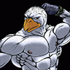
This is what D. Dan would look like in the Megaman Star Force universe. ^^.
This one has a more accurate posture that I was originally aiming for with the other one and the overall body shape and ratios are much more on key as well with the Megaman look I wanted. I figured, due to the hand blaster, that I name him D Drive Star Force since he very much resembles the character on the game. I also admit in getting the blaster idea from the cover, otherwise it would be a palm blasting that ray. It also doesn't hurt to note that I hate doing hands and the profile look was lame to me with the way I was drawing it. LOL.
I find this as one of my finest drawings in the longest time. I most certainly am improving in my figure drawing. To think about two years ago my figure drawings looked mutated to the point of needing to be shot if only to put it out of its misery. Practice definitely makes perfect. LOL.
I was beginning to ink it but made the decision to scan it first in case I screw up this magnificent drawing up royally like I did with others in the past (hence the dark torso area). LOL.
The head also confounded me for awhile do to my disdain for the plain helmet look that looks good with human looking reploids, but not so much with avian or many other animal types. Some can pull it off, but not D Drive. LOL.
I was thinking of detailing the legs more but that would draw the eye away from the head, torso and blaster area. More details draw the eye after all. LOL.
I was originally was going to add another piece of paper and add on to the cape but decided against it. The cape may not align up nicely in the end and may not center the character properly. Extending the cape also would mean adding onto the blast which would, in my mind, call for the need for the bad guy being pwned. I found it too much work for something that looks fine on its own. I need not show everything all the time to get the point across. If Marvel comics did that then each panel would take up too much room and wouldn't look as dramatic (like in one of those dramatic close ups on to one side of the face to show drama). Or I am being lazy and cheap again. LOL.
The difficult part, to my opinion, is to show in some way to make the mouth of both the head and blaster to look mechanical. What I have is, to my opinion, well and good at looking mechanical. The way the cape flows was also a pain since I wanted it to look as though it is pushed back from the force of the blast. I have it flow to the one side to show that as well as have the folds curve in such a way, going into the shoulders and back, to show that the upper torso is also pushed away suddenly and forcefully from the power of the blast. Feet remain in place and legs become angled. The back foot is placed to keep D Drive from falling completely backwards.
Traditional pencil drawing with minor inking, scanned and digitally altered with a sepia filter and a filter to give the lines smoothness and contrast. (unfinished). ^\/^.
Category Artwork (Digital) / General Furry Art
Species Eagle
Size 995 x 1280px
File Size 213.6 kB

Comments