 FA+
FA+
7624
Views
Views
702
Favorites
Favorites
Category
Artwork (Digital) / All
Species Tiger
Size 593 x 835
File Size 238.6 kB
Report this content
More from kamui


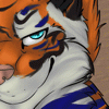
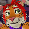
So, 2010, huh? Welcome to the future, guys.
I missed doing a New Year's pic for '09, but this time around we're entering the year of the tiger, and I couldn't pass that up ^_^
So here's our '010 tiggy ushering out the year of the cow with a bang <3
Thanks go to a random pair of bears (like the human kind) in a photo I came across online for the pose ref!
Category Artwork (Digital) / All
Species Tiger
Size 593 x 835px
File Size 238.6 kB


Gee, thanks. I just went all Gene Hackman from The Conversation on my apartment.
My landlady's gonna have a fit, and I'm giving her your number.
My landlady's gonna have a fit, and I'm giving her your number.


New Years antics someplace warm, I guess!
And thanks! It's definitely the scene or the emotion or the idea that's most interesting to paint for me. Drawing manimals is cool and all, but if they're not engaged and doing something or feeling something, it tends to feel flat and I get bored and move on to the next idea ^_^
And thanks! It's definitely the scene or the emotion or the idea that's most interesting to paint for me. Drawing manimals is cool and all, but if they're not engaged and doing something or feeling something, it tends to feel flat and I get bored and move on to the next idea ^_^


Why is it every time you post an image these days, it's a major level-up? Man, you TOTALLY spotted the anatomy on this one. And the varying body types is great. The shadows, especially on that elbow are reminding me a LOT of Maxfield Parrish's work. And the lighting is delicious. The fluffing at the base of the tiger's tail is a great detail; our cat does the same thing when she's over stimulated. Gush gush gush, dood. Really. And tons.


Purrfectly executed and really quite mooving.
Okay, that's out of my system. Well done, sir. I'll echo the sentiments of others: it feels as real as a slice of manimal life ever does. Anatomy and posture do more than check out; they feel right.
"Year of the Goose" indeed... clever and talented. Swoon.
Okay, that's out of my system. Well done, sir. I'll echo the sentiments of others: it feels as real as a slice of manimal life ever does. Anatomy and posture do more than check out; they feel right.
"Year of the Goose" indeed... clever and talented. Swoon.


I was pretty surprised when I went to paint from a reference photo just how washed out and flatly white this dude's side was in strong sunlight. I always overestimate all the little bumps and lumps in the sides and back, when a lot of time in strong light you really don't see much in the way of shadows at all <3
That's why it's good to paint from reference, I guess! The more you knoooo~w ^_^
That's why it's good to paint from reference, I guess! The more you knoooo~w ^_^
Not black and white first, no, but certainly not these exact colors from the get-go. The tiger was a duller, greyer, less saturated orange, and the cow was equally washed out, and his shadows had some extra blue in them. I find that going straight black and white into color is tough, because it's hard to get the values and the hues to match up just so in the same way they would if they were both laid down in the same stroke (by actually painting in color from the start).
But I did do a considerable bit of level / color balance / vibrance tweaking, and piling on textures in layer blending modes like Overlay or Color Burn will usually punch up the saturation a good deal. I was pretty much on-target with what I wanted the basic colors to be from the start on this one (ie, the orange was good as orange, the red was fine as red, etc., on a very general level), but on other pieces where that isn't necessarily the case, I'll also experiment with stuff like Gradient Maps that can take good value data with crummy color decisions and turn it into something that makes a little more sense (or at least is a bit more interesting to look at <3).
Hope that helps, and feel free to ask specific questions if I missed anything!
I think I'm way more comfortable working in value than hue, so my fallback (crutch) is to work quickly in two colors, toggling back and forth between one dark and one light against a mid-tone background in an attempt at building form and depth through a sort of chiaroscuro method. Then color adjustments and gradient maps come in to make those colors into something workable/interesting.
That's pretty similar to a black-and-white to color approach like you mention, but it does sacrifice some amount of control and realism when working with color that people who actually understand color and can paint with color from the start (like freaking fabercastel, that cock) can get out of their work.
So yeah, baby steps towards that end goal ^_^ Try going from straight black-and-white to some color information to more color information, and eventually you'll be doing full-color painting from the outset and only using color adjustments to adjust (imagine that!). I'm definitely working through that process still, too <3

 irian
irian


I leave my brush opacity and flow at 100%, but use brushes that vary flow by pen pressure and use heavier or lighter strokes to get more or less opaque results. When I blend, I grab one of the two colors and lay down a half-opaque stroke, then grab that new color and lay down some paint along the boundary between the two colors.
That gives me three areas: color 1, a 50/50 blend, and color 2. I then repeat that process at both of the new color boundaries to get color 1, a 25/75 blend, a 50/50 blend, a 75/25 blend, and color 2, etc....
That gives me three areas: color 1, a 50/50 blend, and color 2. I then repeat that process at both of the new color boundaries to get color 1, a 25/75 blend, a 50/50 blend, a 75/25 blend, and color 2, etc....
*copies and pastes this into digital-painting notes* As soon as I read this a dozen times I'm sure I'll understand what you're saying Thanks a bunch for taking the time to explain it! :3 I'd ask where you get the awesome textures, however I'm sure you'd answer google :3
Were the couple in the photo you referenced smooching exactly like this? o.o Ass-grope in public? >:3
Were the couple in the photo you referenced smooching exactly like this? o.o Ass-grope in public? >:3

Love the textures in this, and the juxtaposition of the cat and the ox embracing instead of engaged in battle. Although, one could argue that there is a certain amount of aggression coming from the tiger. lol I also like how ambiguous their genders are....Unless it's just me not being able to tell. >.>
I thought perhaps she was just butch or very well defined...if it was a she. lol I tend to draw my tigers a bit muscular or chunky (as a skinny, lean tiger just doesn't look healthy. I mean, a tiger is a big animal.) Considering the rest of your art though I'm content to think that they're both male. Not that it matters really; it's a beautiful picture nonetheless.

Comments