 FA+
FA+
440
Views
Views
32
Favorites
Favorites
Category
Artwork (Digital) / Doodle
Species Dragon (Other)
Size 500 x 500
File Size 213.2 kB
Report this content
More from Draconium


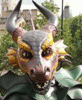
Just some colour practise, random dragon head used.
I know i can't colour properly. several comments on the last thing i submitted helped point out what looked wrong about things. :devgpotious: especially with a little image she scrawled to help illustrate a better method of colouring.
I'm probably going to do a bunch of little things like this, trying to get a grasp on how colours should reflect and more realistically gradiate.
http://toerning.deviantart.com/art/.....olour-93113938 Used this tutorial a bit, especially the part on greying out for shading.
This is gonna take some time...
Please please PLEASE, if you have any tips or ideas, please critique... thanks :)
doodle (C) me
Category Artwork (Digital) / Doodle
Species Dragon (Other)
Size 500 x 500px
File Size 213.2 kB


hmmm very good shading for someone whos still getting to grips with it all.
just one point i would like to make.
the thickness of the black lines disrupt the depth of the drawing. things that should be further back are pulled to the front. the shading gives it depth but the lines make it very flat. maybe cut down on how thick the lines are.
keep it up. i look forward to see more.
yeah, it was a rather low resolution image, so the black lines would be rather obvious (500x500px), but the point of the exercise wasn't to work on my lines, but to focus on the colouring/shading. not trying to make a masterpiece, it is just practise afterall :)
do you have any thoughts about the colouring itself, or any resources i might be able to use?
thank you ^^
do you have any thoughts about the colouring itself, or any resources i might be able to use?
thank you ^^
Comments