 FA+
FA+
1024
Views
Views
72
Favorites
Favorites
Category
All / General Furry Art
Species Vulpine (Other)
Size 719 x 1000
File Size 90.2 kB
Report this content
★
More from Gen


I drew this while waiting for everything to slowly reinstall. I'm finally back on track with a shiny new OS upgrade, a new hard drive, a dozen programs I've had to reinstall, and probably hundreds of program tweaks and fonts I need to set and fetch and aaaaugh...
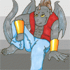
This image is what you'll see if you look at Friday's comic now. Thankfully I finally found a driver for my scanner and it decided to talk nice to Photoshop.
So we're not at 100% yet, but the machine is functional once more and is chugging along once more.
This image is what you'll see if you look at Friday's comic now. Thankfully I finally found a driver for my scanner and it decided to talk nice to Photoshop.
So we're not at 100% yet, but the machine is functional once more and is chugging along once more.
Category All / General Furry Art
Species Vulpine (Other)
Size 719 x 1000px
File Size 90.2 kB


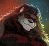


I'm pretty sure you did this one digitally; please correct me if I'm wrong. It looks somehow different from the hand-painting process you showed to us a while back. I think it's your shading method here that gives me that idea.
I noticed that when you shade, you don't simply darken the existing color like many other artists do. You use a different shading color for each base color--for example, the shading on the white fur is a light purple instead of a flat grey. I've heard from other artists that the color choice on your shading/highlighting can really bring some life into a picture.
So I guess my question is, what do you consider when choosing what colors to use for shading/highlighting? What led you to choose, for example, the light purple on white in this one?
For awhile I shaded with light blue (in fact if you look at my 'ten years of Gen' pic I went back and did it on the 'classic' Gen) My main reason for using the purple shading in this picture is that it compliments the other colors. The red of her hair, the blue of her jeans. Red + Blue = Purple :)

Comments