 FA+
FA+
309
Views
Views
6
Favorites
Favorites
Category
Artwork (Digital) / Miscellaneous
Species Unspecified / Any
Size 396 x 550
File Size 28.1 kB
Report this content
More from TKDye


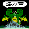
I have this void space in the lower left corner of the back cover of the Newshounds II books, and rather than having Ferris plummet on every book, I thought of having this logo placed there. It looks rather nice, in my opinion, but I think the chief issue I may have is that it might misrepresent NH2 as a kid's work, and it isn't. The themes are more mature than anything kids should be reading.
So I'm thinking about it, but I may end up doing it, because it does look pretty nice.
So I'm thinking about it, but I may end up doing it, because it does look pretty nice.
Category Artwork (Digital) / Miscellaneous
Species Unspecified / Any
Size 396 x 550px
File Size 28.1 kB


I seriously thought about this, because it's a good idea, but decided against it. First, I like the design of the "2" even if it doesn't get squared off. That said, either way I envisioned it. I didn't like how the "II" would look, with serifs or without. Also, I'm going to redesign it with a "1" when I decide to retell the first series. (This is starting to look like a "when" rather than an "if." Goodbye, forties, it was nice knowing you.)


Comments