 FA+
FA+
1222
Views
Views
72
Favorites
Favorites
Category
Designs / Fantasy
Species Dragon (Other)
Size 548 x 463
File Size 65.1 kB
Report this content
More from 9_6


All that talk about censorship just upsets me way more than it should.
So I'm done. Being too paranoid about this thing really goes nowhere.
Less talk, more arts.
So I wanted to make a new version of this.
Something a bit less generic and, hopefully, less ugly.
And also less pokemon-looking.
The problem with the original model was probably that I just started making it with no concept or anything.
So let's try this again.
Here's what I have so far.
What do you think?
Category Designs / Fantasy
Species Dragon (Other)
Size 548 x 463px
File Size 65.1 kB


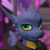
I take it that you enjoy thin limbs, so I won't criticize that aspect of your design. Now, short muzzle, you like short muzzles too, right?, won't complain about that either then.
Some dragons are drawn such that their forehead doesn't intersect in a sharp angle with their muzzle, but this one does not, and that's one of my pet peeves XP it makes them look humanish, but maybe that was your intention.
Also, if I were the banhammer, the age-o-meter would mark "grey area", looks 16-ish or soish. But not human enough, specially if it stands on 4 legs.
And give it more feathers in the wings!, those don't look like they could really fly do they?, unless he/she was really really small.
There, my 2 coppers.

I should have included this in the original post but I didn't think about it:
The colors!
White skin with red horns or hair looks a bit weird, like this one:
http://www.furaffinity.net/view/2848819/
I liked it quite a lot but the color scheme was "creepy".
Now, Pokémon uses red skin with white horns or hair so it's not an option. And also the all popular white with purple details used in both Lugia and Mewtwo is not an option.
Deprived of those very convenient options, I was trying to reduce the "creepy" factor by playing a little with the levels in The GIMP, and I got this:
http://img8.imageshack.us/i/othercolorscheme.jpg/
What do you think?, I like it. Rose and red, looks a lot warmer and less "ghostly".
The point kinda is that I wanna break with all those "pokemon" and "dragon" tropes I have constructed so far.
The "feathers" are kept to 4 intentionally because they are really just huge "fingers".
And also because I don't wanna model a metric buttload of them ;P
As for the head, that one isn't entirely finished yet and it's bound to look "creepier" when modeled too.
Unless I have a stroke of genius and it's somehow not.
The forehead will most likely form a line with the muzzle.
You said "huge eyebrows" aren't needed to be "aged up" and now a distinct lack thereof makes you say it's in a gray area, "age-wise".
Is funny to me.
The huge eyebrows were not needed in and of themselves; they helped, mind you, but they were also aided by a "rough" stare, which this character lacks; and they looked ugly nevertheless :9 . There are other ways to make the character look aged up, but you already visited that place with the special Tails.
Though, all of that will probably not be needed since the character will spend most of the time in 4 legs and I think banning a quadrupedal character because it resembles 'a child/teenager' would be stretching it too far, now that I think of it.
Though, all of that will probably not be needed since the character will spend most of the time in 4 legs and I think banning a quadrupedal character because it resembles 'a child/teenager' would be stretching it too far, now that I think of it.
Aww, I actually kind of liked the old generic one specifically for that plainness she had. This one's certainly not bad either, though. I'm liking the large (feathers?) on the wings and the way the base color of the body extends along where the bones are in the wing. The ears make it come across as a bit elfish, but that's not necessarily a bad thing, I suppose. I'm a fan of the lean build. Streamlined bodies and curves are always nice.


The original one was farr to char like. This is much better imo. I'd throw a third color in there though, cyan or green, to spice it up a bit. Not make any new markings, but have a centered or mostly exterior horn or something a different color. But what you have now is pretty cool

When I first looked at him, the forelimb seemed a bit small. If you thicken it up near the shoulder, it will not only look a bit more proportionally correct, but also useable in a quadrupedal form. As it is now, he'll fall over on his head. :p
I also agree with Insomniac, the white and red is nice, not creepy, but it could use a third to be more distinctive. Not sure on the color though.
I also agree with Insomniac, the white and red is nice, not creepy, but it could use a third to be more distinctive. Not sure on the color though.


That actually looks pretty awesome for a new character design. It looks cute, but I don't think it looks cub at all. Don't be afraid of doing your art the way you want it. people are always going to be nailed for doing cute things or things that are small, etc. And if the mods have a problem with it, IT'S YOUR STYLE. And tell dragoneer about it. I sent him a note, too, because people were saying my character was small, cute and flatchested therefor a cub so i noted him so mods wouldn't go after me. This is your style, and it's a great style, in my honest opinion. keep doing designs and awesome characters and ignore the trolls who scream cub. because if they are going to cry about it, their minds were in the gutter anyway and they wanted to find problems with stuff.


Hm. I like the design, personally. Red-on-white isn't a color combo you see too often, and I like the kinda half-n-half wing design, very creative. I'd just make sure before you get too far along to do a straight-on view of the face, too; the front view is always the one that trips me up when I model.


Comments