 FA+
FA+
3933
Views
Views
593
Favorites
Favorites
Category
Artwork (Digital) / Fantasy
Species Western Dragon
Size 1280 x 1280
File Size 462.4 kB
Report this content
★
More from Chromamancer


Finished some more art.
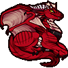
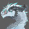
I saw a contest about winter and summer over on DA, and it gave me a neat idea for a picture.
It also gave me another piece to include glowing warm colors against a cool background. Light sources like that are always fun to work with.
The trees were an interesting challenge, too.
The glowing chest jewel was probably inspired by Dragonheart. That's still one of my favorite movies...
I tried to sketch this one out in a real rough manner, and make the line art last. This was going to be a quick sketch, but I ended up putting quite a bit of time into it again. Sketching can be really good practice, but when one turns out nicely, I want to make the final picture as good as I possibly can.
Now, I'll have to get caught back up on my messages... I have a bad habit of putting them off, when I'm just about done with a piece of art.
Category Artwork (Digital) / Fantasy
Species Western Dragon
Size 1280 x 1280px
File Size 462.4 kB


Thank you. It's an honor to hear that. I'll do my best to keep making interesting art.
I always like night sky scenes, and I found a good tutorial about making stars, a while back.
Now, if I have a dark portion in the sky, it feels empty until I throw a few stars in there.
I always like night sky scenes, and I found a good tutorial about making stars, a while back.
Now, if I have a dark portion in the sky, it feels empty until I throw a few stars in there.


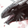
I'm an evil dragoness, but I also love nature...and control. This picture just shows, how a dragon can keep things safe (alive/pretty/sheltered) which is important to his/her...or at least finds it entertaining. This piece is very calming. I aslo like the contrasts on the picture: the obvious is the weather, but how did a different species of tree grow in a forest of pine trees? No need to ask, it's awesome. It's like protecting a lonly weak individual from the rest, until it grows strong enough to live alone! Cool.


It's been a while since you uploaded something that left me this impressed.
There was a burst of improvement, and, it's not that your technique improved suddenly, it's that you did something you hadn't done before. I have seen the theme of "dragon holds something radiant close to him" before ( http://www.furaffinity.net/view/4726338 ) as well as "dragon stands with his forearms on top of each other" ( http://www.furaffinity.net/view/4562655 ); no, what's new, is how you combined them; what is powerful is the background --those very evocative evergreen trees-- in contrast to the gem casting shades of orange on a lone tree, and the way the image flows from there, to the gem, to the chest of the dragon, and up the neck to meet his gaze ( http://www.furaffinity.net/view/3942473/ ) with orange eyes and matching jewelry. All that flow made for a crowning moment of awesome, right when my eyes met his stare, and eventually dissolved in her horns (I'm switching the pronoun because I don't know which one is correct for this dragon, and don't care that much either).
Did I mention you had me jaw drop when I saw this?.
Do you know when was the last time this happened?,
http://www.furaffinity.net/view/3942473/
Back when I met you!, I had never seen anything like that ever since!.
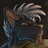
There is as always things that could be improved, I still feel strange when I look at your dragon's thick fingers and short metacarpus, but I can rest in peace knowing that's just your style, though you did one with a longer metacarpus, shorter and thicker fingers: http://www.furaffinity.net/view/4726338/ so I'm not exactly sure what to make of it.
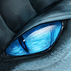
I can say that out of all your dragons, my favorites have been those with simple eyes (like here in Always Summer and in Gentle Eyes), with not so much rough stuff around their eyelids (typical example http://www.furaffinity.net/view/4562655 ).
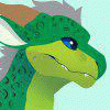
I will also say that they look much better fully scaled, like the face of this one (Always Summer) or the whole of Gentle Eyes, than with patches of scaliness against a mass of shaded colors. I believe that technique mixes better with cel shading, which you may want to try one day.
But all of that stuff is subjective, there is nothing "objectively" wrong I could criticize and point out exactly what is wrong. So the best I can do for you now is saying that something looks wrong with the shoulders and chest of this dragon, but I don't know what it is; it seems they are too small, but I couldn't be sure, I'm not even sure if that's an objective mistake, but it looks wrong (just like the hands, but I know that's a subjective thing with me; or maybe they are related and the arms in general look too big for his/her body?).
Well,
Congratulations to you, fascinating step forward, this is one very pretty composition.
You've left me impressed again :}
There was a burst of improvement, and, it's not that your technique improved suddenly, it's that you did something you hadn't done before. I have seen the theme of "dragon holds something radiant close to him" before ( http://www.furaffinity.net/view/4726338 ) as well as "dragon stands with his forearms on top of each other" ( http://www.furaffinity.net/view/4562655 ); no, what's new, is how you combined them; what is powerful is the background --those very evocative evergreen trees-- in contrast to the gem casting shades of orange on a lone tree, and the way the image flows from there, to the gem, to the chest of the dragon, and up the neck to meet his gaze ( http://www.furaffinity.net/view/3942473/ ) with orange eyes and matching jewelry. All that flow made for a crowning moment of awesome, right when my eyes met his stare, and eventually dissolved in her horns (I'm switching the pronoun because I don't know which one is correct for this dragon, and don't care that much either).
Did I mention you had me jaw drop when I saw this?.
Do you know when was the last time this happened?,
http://www.furaffinity.net/view/3942473/
Back when I met you!, I had never seen anything like that ever since!.
There is as always things that could be improved, I still feel strange when I look at your dragon's thick fingers and short metacarpus, but I can rest in peace knowing that's just your style, though you did one with a longer metacarpus, shorter and thicker fingers: http://www.furaffinity.net/view/4726338/ so I'm not exactly sure what to make of it.
I can say that out of all your dragons, my favorites have been those with simple eyes (like here in Always Summer and in Gentle Eyes), with not so much rough stuff around their eyelids (typical example http://www.furaffinity.net/view/4562655 ).
I will also say that they look much better fully scaled, like the face of this one (Always Summer) or the whole of Gentle Eyes, than with patches of scaliness against a mass of shaded colors. I believe that technique mixes better with cel shading, which you may want to try one day.
But all of that stuff is subjective, there is nothing "objectively" wrong I could criticize and point out exactly what is wrong. So the best I can do for you now is saying that something looks wrong with the shoulders and chest of this dragon, but I don't know what it is; it seems they are too small, but I couldn't be sure, I'm not even sure if that's an objective mistake, but it looks wrong (just like the hands, but I know that's a subjective thing with me; or maybe they are related and the arms in general look too big for his/her body?).
Well,
Congratulations to you, fascinating step forward, this is one very pretty composition.
You've left me impressed again :}
PS: On close examination, in Gentle Eyes, every part of the dragon's skin looked equally detailed, but in most of your other dragons, there's been a difference in detail. In this one, the face is so gracefully detailed that it could be an image of its own. It looks elegant, like it was sculpted to perfection; while the rest of the body looks patchy. I am convinced that detailing the entire dragon like the face will do wonders for whatever picture you try to experiment with; of course it will also be a nightmare to do and an ordeal of patience to complete, so it's up to you whether you're willing to endure that :> but I am almost sure that the detail is not the only improvement your work needs to look flawless, there is something, somewhere... one good artist may help you spot what is hidden there, my eye is not good enough to spot it. But I know this composition is gorgeous, you are into something here, keep it up!.
I made a few pieces where there was plenty of detail, but a frustrating lack of focus, so lately I've been trying to use detail to draw attention to certain areas of the pictures. Sometimes uneven detail can be one way to draw the focus to the more detailed parts of the picture. Here, I spent a lot of time and tried to put plenty of detail into the face, and into that warm region around the tree.
From observing and studying other art that I tend to look up to, I think the kind of things I need to work on and practice the most are using a variety of different settings, and being a bit more creative with the perspective and point of view. There are many awesome artists out there that just make things that look... effortless and amazing. I am still relatively inexperienced. I think inconsistencies tend to creep into my pictures because I basically re-draw portions of my pictures until they start to look right. So, sometimes different parts of my pictures may not match up ideally, because they were drawn at different times.
For instance, I started over on this one once completely. The first time I tried drawing it, the perspective and composition was rather boring and awkward. I re-drew the front legs and paws a few times, too.
Perhaps, I really should make a bunch of quick and loose sketches.
Anyway, I'll continue to do my best to learn from criticism and my own observations.
It's good to hear that I've been improving. I'm really glad to hear that this picture could have that kind of impact.
That crossed paws position is one of the ways that I see my cats sit rather often, and it seems to fit well with dragon poses, so I use it from time to time. The cats always seem comfortable enough sitting like that, after all. ;) Overall, I had a lot of fun playing around with the coloring and lighting on this piece.
I've really been enjoying the lighting and coloring on Centradragon's latest speedpaints. They are very impressive and make me want to try some quicker pictures and all sorts of new things.
As far as the metacarpus goes, I do have difficulty drawing those front claws quite often. I started this picture without line art, and added that part of things in later. I ended up re-drawing those front claws a few times, and eventually got them into a reasonable shape. It is more like something that I struggle with, than something that is just my style.
Ideally, I would be able to use several different shapes and not be restricted to one type or form of claws. I'll probably have to sketch out some different designs and study a few different types of animals...
Things like that are nice reminders that while I've been improving, I still have much to learn.
A while ago, I would cover dragons with scales, and try to make the detail uniform, like on http://fav.me/d1xd9a9. But, around the time I made http://www.furaffinity.net/view/3942473/ I saw several awesome pieces of art where scales are shown with texture, instead of clear lines, so I had to give that a try, too. Since then, my method has oscillated a bit, and now I like drawing in some scales clearly, to add a bit more of a focus to certain areas of the picture.
The point you make is interesting, though. Now, I might be able to maintain a solid focus with composition and color, so I may be able to add in more detail without making it distracting. Perhaps, I'll be able to figure out a way to use the advantages of both methods well with a little experimentation.
Thank you again for your interesting analysis.


I'm glad you enjoy it.
There is a higher resolution version here: http://chromamancer.deviantart.com/.....Here-193343470
I don't know how large your monitor is, but that version is 1920x1920, so it's a bit bigger than the one on FA here.
There is a higher resolution version here: http://chromamancer.deviantart.com/.....Here-193343470
I don't know how large your monitor is, but that version is 1920x1920, so it's a bit bigger than the one on FA here.


You always have a good eye for lighting, and this one is particularly beautiful the way the light contrasts with the snow and dragon colors. I also like how you do the scales, enough to show that this is an armored dragon but the scales aren't in your face. Nicely done! :D

I start to sound repetitive when I say how much I love your textures! I do with there was a bit more texture on the body to match the face, but compositionally, I know that it was to draw attention to that wonderful tree!
The background is breath taking, and your details even in the clouds are astounding. And going back to the dragon, I love how the scales almost look crystalline.
Wonderful work as always!
The background is breath taking, and your details even in the clouds are astounding. And going back to the dragon, I love how the scales almost look crystalline.
Wonderful work as always!


Comments