 FA+
FA+
3984
Views
Views
533
Favorites
Favorites
Category
Artwork (Digital) / Fantasy
Species Eastern Dragon
Size 1280 x 720
File Size 296 kB
Report this content
★
More from Chromamancer


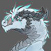
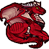
Finally finished!
From the initial sketch, every piece of this picture changed at least once. Overall, this was a very frustrating piece to work on. It's been a while since I've drawn an eastern style dragon, so I thought I'd give it a shot. It took several attempts to find a good pose and design, but I think it turned out well in the end.
I've been trying out some different brush packs lately. The magic circles are stock from http://redheadstock.deviantart.com/.....ushes-63580135 Some brushes by tojo-the-thief were also useful for some of the shading on the body. http://www.furaffinity.net/journal/1942236/ I defined a few more brushes of my own for this one, as well.
One of my goals for this piece was to show a smoother texture and more even distribution of detail on this picture. Contrasting the light and dark ares on this one was a rather interesting exercise, too.
I hope you enjoy it!
Higher resolution here: http://chromamancer.deviantart.com/.....ryuu-197122474
From the initial sketch, every piece of this picture changed at least once. Overall, this was a very frustrating piece to work on. It's been a while since I've drawn an eastern style dragon, so I thought I'd give it a shot. It took several attempts to find a good pose and design, but I think it turned out well in the end.
I've been trying out some different brush packs lately. The magic circles are stock from http://redheadstock.deviantart.com/.....ushes-63580135 Some brushes by
 tojo-the-thief were also useful for some of the shading on the body. http://www.furaffinity.net/journal/1942236/ I defined a few more brushes of my own for this one, as well.
One of my goals for this piece was to show a smoother texture and more even distribution of detail on this picture. Contrasting the light and dark ares on this one was a rather interesting exercise, too.
I hope you enjoy it!
Higher resolution here: http://chromamancer.deviantart.com/.....ryuu-197122474
Category Artwork (Digital) / Fantasy
Species Eastern Dragon
Size 1280 x 720px
File Size 296 kB


I'm glad it makes a good desktop.
I do have a larger version up on DA. http://chromamancer.deviantart.com/.....ryuu-197122474
FA makes me resize it down to 1280 pixels, but you can download one at 2400x1350 over there, if you're looking for a higher res version.
I do have a larger version up on DA. http://chromamancer.deviantart.com/.....ryuu-197122474
FA makes me resize it down to 1280 pixels, but you can download one at 2400x1350 over there, if you're looking for a higher res version.
Thank you!
The thing on it's back is a mirror. I've seen those sorts of mirrors used in several character designs based on eastern mythology. Amaterasu, in Okami is a rather well known character that has something similar, for instance. I think those things are fun and that one of them would be more interesting than wings on this picture.
The thing on it's back is a mirror. I've seen those sorts of mirrors used in several character designs based on eastern mythology. Amaterasu, in Okami is a rather well known character that has something similar, for instance. I think those things are fun and that one of them would be more interesting than wings on this picture.


![[r-e-n-d]](http://a.furaffinity.net/1424255659/%5Br-e-n-d%5D.gif)
Thank you.
I'm glad you enjoy this one.
The magic circles are stock brushes from this brush pack: http://redheadstock.deviantart.com/.....ushes-63580135
After seeing them, I figured they are much to awesome to ignore.
I'm glad you enjoy this one.
The magic circles are stock brushes from this brush pack: http://redheadstock.deviantart.com/.....ushes-63580135
After seeing them, I figured they are much to awesome to ignore.

Yep.
In eastern mythology Seiryuu is the guardian of the east. http://en.wikipedia.org/wiki/Azure_Dragon
It has different names in other cultures, but as a mythological creature it appears in many things.
I'm glad you enjoy it, here.
In eastern mythology Seiryuu is the guardian of the east. http://en.wikipedia.org/wiki/Azure_Dragon
It has different names in other cultures, but as a mythological creature it appears in many things.
I'm glad you enjoy it, here.


Which other one? I've made a few different pictures...
If you're looking for some higher resolution desktops, I do have larger versions of my art available on DA. http://chromamancer.deviantart.com/.....ryuu-197122474
That version is 2400x1350, so it may make a much better desktop if you have a large monitor.
If you're looking for some higher resolution desktops, I do have larger versions of my art available on DA. http://chromamancer.deviantart.com/.....ryuu-197122474
That version is 2400x1350, so it may make a much better desktop if you have a large monitor.


Thank you.
Hmm... Do you have any idea what part of the disc is bothering you?
I noticed that before when I was working on it, and the disc looked really out of place for a while, but I thought I caught that when I redid the shading on it.
Maybe I should just try to bluff my way through that one, though. Sometimes unintentional mistakes can lead to neat little details in art.

Oh I'm not seeing that effect as mistake at all. It's really fascinating .. your shading definitely worked,
because when I look at the rim of the disk I know what position it's supposed to have, but when
I focus in the centre of the circle the room seems to turn and it appears as if one was looking on the top side
of a horizontal disk instead of the front side of a vertical disk. I bet that sounds as confusing as it looks xD

You outdid yourself this time, this doesn't look like typical Chromamancer.
This picture has your characteristic coloring, calm and soothing and with few hues (and you picked my favorite color!, +1), but the detail and the finish everywhere, and the lack of obvious mistakes or contrasts in quality are different to nearly all of your previous works. This is without a doubt Chromamancer 2.0, with the power of self-improvement!.
You get a Fav and a wow! and I'm going to show this to all my friends!.
Wonderful work!.
PS: The only area I'd change slightly would be the toes of the hind feet, but that is slightly a thing of personal taste, it's just that 3 toes of the same length and extending on the same direction look very strange, not even human toes (who tend to be really boring) or our hands are so regular. But it's a small detail, and I don't think anyone but a fetishist like me would notice unless they'd look at it for hours. For everything else I really tip my hat to you, this is a consummate painting.
Thank you.
I'm glad to hear that this one looks like a good step forward.
Critiques like yours have been a large factor in my improvement, I think.
Quite I have a hard time noticing mistakes that I tend to make out of habit, but critiques help bring those sorts of issues to my attention. The feet on this picture are a good example of that. I tried a few different designs for the front claws, and ended up going with one that hopefully looks a bit longer and more elegant. I tried to make the feet proportional, but I didn't pay as much attention to the toe length on this one.
I've made a minor retouch that extends the middle toe a little, to match the elongated middle claw, to correct for that oversight.
I'll do my best to keep improving.
Thanks again.


Thank you.
I usually lean toward analogous and split complimentary color schemes. Also, I try to keep everything in balance chromatically. This thread explains that better than anything else I've seen: http://www.conceptart.org/forums/sh.....ad.php?t=17837
Also, I tend to work in black and white for a while before adding color to my pieces. This allows for a decent amount of flexibility, so I usually try several color schemes before finding a good one. For instance, the magic circles on this one were yellow at first. They looked decent, but they didn't seem to fit into the color scheme as well as the teal.
It's much easier to come up with an effective color scheme if you have the flexibility to change things as you go.


Comments