 FA+
FA+
502
Views
Views
29
Favorites
Favorites
Category
All / All
Species Unspecified / Any
Size 655 x 1009
File Size 433.2 kB
Report this content
More from Dehv-Bat


For my electronic illustration class we had to make up/give ourselves a "realistic" job to do for any sort of client. We could do anything so long as it was believable and we used the following programs: Illustrator, Photoshop or Painter. Oh, and we also had a theme, transformation.
I decided to do 2 gig posters (yeah, it has to be two illustrations) for one of my favorite Screamo bands. http://www.youtube.com/watch?v=_SqYoJhs7Tk&feature=autoplay&list=QL&index=3&playnext=3 hmm yeeessss. The transformation aspect of my posters will be the transformation from life to death since one of my favorite songs by the band talks about that. The second one has yet to be finished, but hopefully once I finish it the two will work together nicely. The teacher's not too strict on the theme being SUPER APPARENT so I think I'll do okay.
The actual size of the poster is 11"x17" SO IT TOOK FOREVER TO COLOR...Also editing that text took ages too. OH, OH, and inking...I'm not too great at using the pen tool in Illustrator, damn tool takes forever.
Category All / All
Species Unspecified / Any
Size 655 x 1009px
File Size 433.2 kB


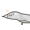
I was strolling over the dark corners of FurAffinity (actually just the main page) and I find this.
And when I found this I noticed the thumbnail looked exceptionally good; then I click and it kept looking good. I reflected a little on the meaning of this.
Boy what a great use of negative space!, That's what it means!. Perfect balance there, with the ravens on the foreground, and the slowly fading background; Excellent!.
The image otherwise has nothing interesting for me (I have to be honest here!), except, well, I like crows, but if it were about enjoying crows I could watch photographs. But what's refreshing is finding this sort of stuff in FurAffinity; and... now that I think about it... if I found this on deviantART it would have boring human faces all over the place --faces that I see every day in the metro and the streets-- and a frivolous message about whatever the designer wanted to say (probably having to do with "everything is art!", which implies art is nothing, since if everything is art, nothing is); it may even have the great use of negative and positive space, but I'd feel almost dumb praising his work, and doubly stupid for faving it/adding to my collection (since DA has collections); after all, I see that sort of stuff everywhere...
...you know what?, Maybe it was actually the crows ^_^ that was good enough for me.
Thank you for inspiring me :)

Nice to see more CTTS fans out there! They're one of the few screamo bands out there that I really like. This poster really reflects the nature of the song your talking about too! Very nice! I love ow you used the negative space in the middle where the treeline is. Nice work!

Comments