 FA+
FA+
269
Views
Views
2
Favorites
Favorites
Category
All / All
Species Unspecified / Any
Size 633 x 513
File Size 1.04 MB
Report this content
More from custom-metal-collars


f5 to see both?
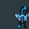
i need some input on this, please any constructive crits, let me know. i gota print ASAP
i need some input on this, please any constructive crits, let me know. i gota print ASAP
Category All / All
Species Unspecified / Any
Size 633 x 513px
File Size 1.04 MB


Honestly, it doesn't grab my attention. Aside from the random tail, it's just words and a QR code. There is no uniqueness at all to it, and I've seen that setup many times before, it's overused and boring now. Simple is right, it's placed nicely, just doesn't make me want to look twice at it, and doesn't make it linger in my mind.
I would rather put it on two side:
One would be the logo only, and the other side the scanner thingy for phone and the email adress, and websites. It would look more clean then just all stuck and super small (since when you think about it, this will be about 3.5 x 2inch here, so it be pretty squeeze). But if you can't afford a two sided, stay it like this!
I saw somebody talking about metal rings or anything, don't put any images of what you do, or pattern or anything like that, it be too much to look at it! And when you'll give those cards, your product might be beside it, and if not, it will pick the curiosity of people to come take a peek! But if your not sure, just look around for metal pattern, website like this one: http://www.cgtextures.com/ (look in the metal section) might offer a large variety to look and test !
Just some word from an infographic, hoping it could help out a little! (I don't have the trhought because I have a diploma, just my opinion!)
i definatly understand the simplicity part of it, and was worried about the size as well, did a few print outs to see if it would be too small but is looking good size wise for the print.
for now ill have to use 1 sided.
put up a scaled version f5 to see it?
thinking if i play around with the size and placement it will look pretty good without being too crowded.
for now ill have to use 1 sided.
put up a scaled version f5 to see it?
thinking if i play around with the size and placement it will look pretty good without being too crowded.
Best thing to do to see, that's for sure!
And stupid FA, I always forget that you need to F5 all on this website OYL
But, I found it a tad crowded like you say, and we clearly lose the website and all the writing. I don't know if you make the BG transparent a bit (not too much), if it would help though... Or if they're a way to mixt the BG of metal with the BG of scale? But I would try to make it more pale to see... And/or the change the color of the writing to not lose it (and its always more dark when printing, since it fall into CMYK... Test it again with printing?


I really love the design on the right. It's really cool and catchy. Is there any way to add some shading on the 4 corners? I think if you could do that it may bring out the logo a bit more :P, but that's just my input. I'm not sure on how it would look, but it's just something that might work X3
*totaly intrude some other comment*
If your logo have a trasparent BG and if you work in photoshop, use the magic want to remove all white or anything to keep only your logo, go in the blending option (double click the layer of the image), and you can put effect on it! Find the one that can put some 'light' around it, it would get out a bit?
Or simply the example here: http://img97.imageshack.us/img97/89.....examplegvx.png
(my photoshop is in french though, but you can figure out) (and I took your avatar for that, the why its super smal)

Comments