 FA+
FA+
5290
Views
Views
553
Favorites
Favorites
Category
Artwork (Digital) / Fantasy
Species Cervine (Other)
Size 667 x 1000
File Size 281.1 kB
Report this content
More from Stigmata


![[MYTHOLOGY] Cernunnos](http://d.furaffinity.net/art/stigmata/1341710470/1341710470.stigmata_jonathanvair_cernunnos.jpg "Click to change the View")

Check out the updated image and prints here:
https://www.furaffinity.net/view/54776079/
https://www.furaffinity.net/view/54776079/
https://www.furaffinity.net/view/54776079/
7/17 EDIT: Refresh for a less confusingly saturated image. Thanks for the crits, friends!
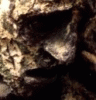
Commission for chocolatemuscle—the idea was to use his build as references for the Celtic god of fertility and natural order. Really cool guy, for the record. c:
The mythology commissions will probably stray from the the square orientation and typical colour scheme in favour of stretching my muscles some. Hope that's okay. :3
https://www.furaffinity.net/view/54776079/
https://www.furaffinity.net/view/54776079/
https://www.furaffinity.net/view/54776079/
7/17 EDIT: Refresh for a less confusingly saturated image. Thanks for the crits, friends!
Commission for chocolatemuscle—the idea was to use his build as references for the Celtic god of fertility and natural order. Really cool guy, for the record. c:
The mythology commissions will probably stray from the the square orientation and typical colour scheme in favour of stretching my muscles some. Hope that's okay. :3
Category Artwork (Digital) / Fantasy
Species Cervine (Other)
Size 667 x 1000px
File Size 281.1 kB


This is great, nobody's going to argue against that. :) But it's so busy, I know with the leaves and light and your lovely brushwork it's gonna be that way, but maybe use values/colour to seperate the character from the background and foreground? Beautiful as he is he takes a little work to distinguish him from the rest.
I completely agree. This is one of those ambitious things that I new would be a risk, and while it barely squeaks by the squint test, a more experienced artist would have made different colour choices to bring that last 5% home. It's a strange balancing act, so I'm glad to hear you reference my room for improvement!
Thanks, BNG. <3
Thanks, BNG. <3


damn your mark making rules, and I like the choice of the warm yellows and browns used too.
Created a nice focal point with the contrast of sharp and hard edges, just think you could put some lighter values behind the character so they pop out more and be easier to read.
Keep it up Jon!
Created a nice focal point with the contrast of sharp and hard edges, just think you could put some lighter values behind the character so they pop out more and be easier to read.
Keep it up Jon!

I will agree with Stu on p much everything, but suggest an added thing to try:
Bigger strokes in the background? Could be worth cleaning up the background a bit, to keep the attention on the character.
Fucking hell though, I've got some respect for your stuff. Those hands.
Bigger strokes in the background? Could be worth cleaning up the background a bit, to keep the attention on the character.
Fucking hell though, I've got some respect for your stuff. Those hands.


Cool stuff as per usual! You've really got a singular rendering style (as far as I know, that is). The background fights for my attention a bit, though, probably because of all of that saturation and warm/cool contrast its got! I think it'd be an easy fix if you wanted to tone it down a bit, though.


Comments