 FA+
FA+
14511
Views
Views
396
Favorites
Favorites
Category
All / All
Species Unspecified / Any
Size 612 x 842
File Size 198 kB
Report this content
More from Fisk


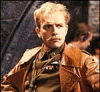
This is the cover to the "Puppy Love" project, which is completed. I went for the overboard cuteness here, but there are a few strange areas in her pose that weren't too noticeable until I put on the colors and had it about finished. Her farthest cheekfluff is too protruding and her near most shoulder is more forward than it should be, I think. But the hips are sweet, as always. I went for the sweet, hip-clinging crack jeans she was wearing in the "Lazy Bums" picture I did a long time ago. They look great, but I don't know how practical they are.
Category All / All
Species Unspecified / Any
Size 612 x 842px
File Size 198 kB


Hrm. Someone else in the UK had this same problem, and I've placed calls to my authorization company over it and no one can give me any reason as to why that is. They swear they haven't changed any of their authorization criteria. It is possible, I suppose, that your bank has changed its authorization protocols for transactions? That is all I can imagine.


Yes, the cheek ruff is distended. This is not a problem though. Sometimes it is best to distort visual reality in order to make the two dimensional image, which imposes its own limitations and distortions, look “right.” This was the point the Futurists, Expressionists and Cubists were trying to make with their figure rendering; they would often show portions of the figure that would not be visible in a true plane image at a single instant in time. Their intention was to produce a two dimensional figure that was not visually flat. They made modifications to the view to make the image meaningful to the viewer. People don’t experience figures in snap shots, they build them over a short period of time and from several angles.


Hip-clinging crack jeans I'd imagine would be quite practical to a girl who has to contend with a tail on a daily basis. No need for an annoying extra button on the back of the waist band or futzing around with trying to poke it through a hole, she can just slide them on and get going no problem.
Well, that and look insanely cute as well. :)
Well, that and look insanely cute as well. :)


Naw, I think your style excuses the errors. Meaning, they blend well enough given the pose and linework, that A. they're not that noticable and B. the general structure is still nice. I can see where the shoulder might be off, true, but the cheek I think would look strange any bigger or smaller.
Jessica's always been a favourite character of mine from you, simply because the comic panels of her are almost "dumbed down" and highly amusing. Plus she's klutzy-adorable. And you draw her matching so well. Nicely done!
Jessica's always been a favourite character of mine from you, simply because the comic panels of her are almost "dumbed down" and highly amusing. Plus she's klutzy-adorable. And you draw her matching so well. Nicely done!


Gotta love friends, picket fences and happy endings. And I don't know what it is about Beth's face in the last frame, but the way she's sticking her head into the shot screams *poink*.
And Robert's face with the ice cream. It's a perfect combo of *well, this is embarrassing* and *crap, that's my vanilla*.
And Robert's face with the ice cream. It's a perfect combo of *well, this is embarrassing* and *crap, that's my vanilla*.


Comments